The Death of the Clean Era
For a decade, the global visual landscape was dominated by a sterile, frictionless minimalism. We call it 'Blanding'—the phenomenon where every luxury house and tech giant adopted the same sans-serif typeface, the same muted palettes, and the same airy white space. It was a race to the middle, a quest for a universal legibility that eventually became invisible. But look at the runways in Paris or the digital interfaces emerging from Tokyo today, and you will see a violent rejection of this smoothness. Brands are no longer asking if a design is pleasing; they are asking if it is provocative.
This is not an accident. It is a calculated pivot toward the 'Anti-Aesthetic.' By deliberately incorporating elements traditionally viewed as ugly—clashing colors, distorted proportions, and raw, unfinished textures—brands are attempting to break through the noise of a hyper-optimized digital world. When everything is filtered to perfection, the unfiltered becomes the ultimate luxury. The 'ugly' is now a signal of confidence, a way for a brand to say they are so dominant they no longer need to adhere to the rules of traditional beauty to attract a customer.
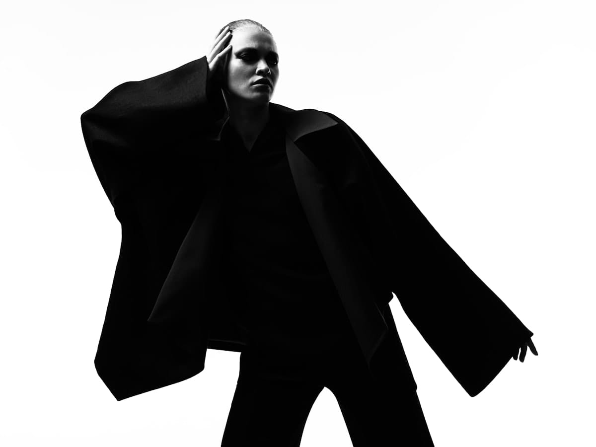
Compare the visual strategy of the current quarter to the same period twelve months ago. A year ago, the 'Clean Girl' aesthetic—characterized by dewiness, minimalism, and order—was the peak of aspirational content. Today, we see the rise of 'Indie Sleaze' and 'Cluttercore,' styles that embrace the messy, the chaotic, and the intentionally dated. This delta represents a fundamental shift in consumer psychology: a move from the pursuit of an idealized life to the celebration of a lived-in, flawed reality (Source: WGSN, 2024).
"The current obsession with the anti-aesthetic is essentially a rebellion against the algorithm. When AI can generate a perfectly symmetrical, aesthetically pleasing image in seconds, the human eye begins to crave the glitch, the error, and the jarring choice because those are the only things that feel authentically human."— Elena Rossi, Design Strategist at the Milan Institute of Visual Arts
Signaling via the Subversive
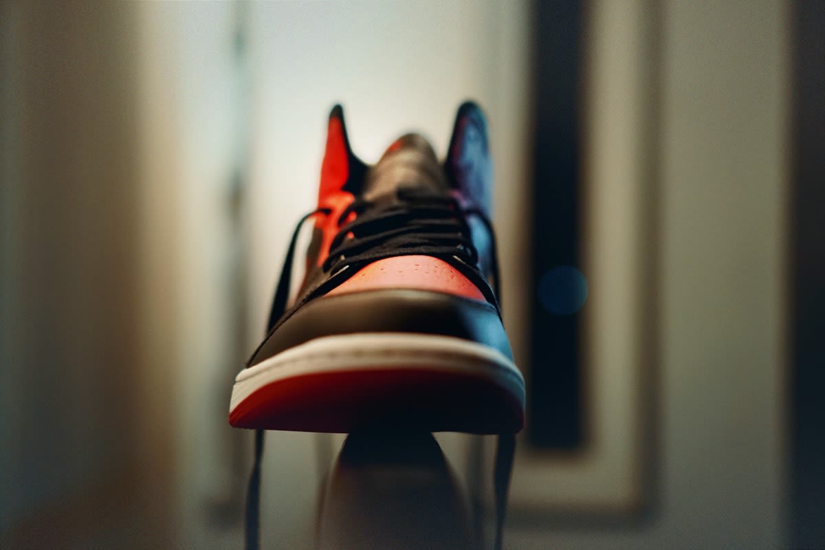
Why would a brand spend millions to look cheap or jarring? The answer lies in high-status signaling. In sociology, this is often linked to the 'counter-signaling' theory: once a certain aesthetic becomes accessible to the masses, the true elite pivot to something that looks 'wrong' to the uninitiated. When the middle class buys 'minimalist luxury,' the ultra-wealthy buy a sneaker that looks like a weathered thrift-store find. It is a way of asserting that one's status is so secure that they can afford to flout the very rules of taste that others are desperately trying to follow.
We see this playing out globally, not just in the West. In Seoul, the 'ugly-cool' trend manifests in oversized, distorted streetwear that challenges traditional notions of fit and form. In Berlin, the techno-industrial aesthetic embraces the brutalism of concrete and steel, turning the bleakness of post-industrial spaces into a high-fashion backdrop. The common thread is a desire for 'friction.' These brands are creating a visual speed bump that forces the viewer to stop and question why something is considered ugly, and in doing so, they capture an attention span that has been eroded by endless scrolling.
From a practitioner's perspective, this shift creates an incredible amount of friction inside the creative process. I have sat in agency war rooms where the debate isn't about whether a design is 'good' in the classical sense, but whether it is 'wrong' in the right way. The tension exists between the CMO, who fears alienating the core customer, and the Creative Director, who knows that playing it safe is the fastest route to irrelevance. The real skill now isn't in achieving harmony, but in mastering the precise frequency of discord that feels avant-garde rather than amateur.
| Feature | The Blanding Era (2014-2022) | The Anti-Aesthetic Pivot (2023-Present) |
|---|---|---|
| Typography | Geometric Sans-Serif (Uniform) | Experimental, Distorted, or 'Default' fonts |
| Color Palette | Muted Neutrals / Monochrome | High-Contrast Clashing / Neon-Earth Tones |
| Composition | Symmetrical, Airy, Centered | Asymmetrical, Crowded, Brutalist |
| Emotional Goal | Trust, Efficiency, Calm | Provocation, Authenticity, Irony |
The Digital Pivot: Web Brutalism and UX Chaos
The pivot isn't limited to physical products; it is invading the digital realm. For years, User Experience (UX) design has been obsessed with 'reducing friction.' The goal was to make the journey from landing page to checkout as invisible as possible. However, a new wave of 'Digital Brutalism' is emerging. These websites feature raw HTML looks, jarring system fonts, and navigation that feels intentionally clunky. By introducing friction, these brands create a memorable experience that stands out against the sea of identical Shopify templates (Source: Awwwards Design Report, 2023).
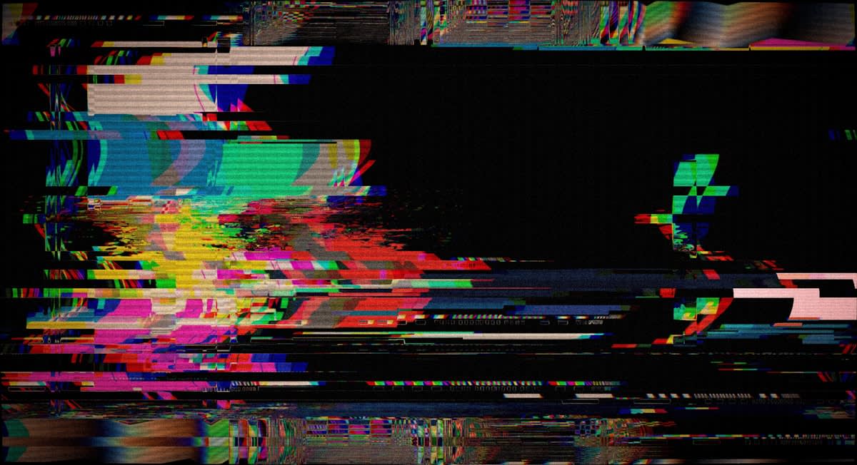
This digital rebellion is largely driven by Gen Z's innate skepticism of corporate polish. To a generation that grew up with the internet, a perfectly curated corporate site feels like a lie. A site that looks like it was built in 1997, or one that uses 'ugly' neon borders and overlapping text, feels more honest. It suggests a brand that is more interested in its community and its product than in a polished corporate image. It is the visual equivalent of a lo-fi recording—the hiss and the pop are what make it feel real.
- Intentional Asymmetry: Breaking the grid to create visual tension.
- Defaultism: Using system fonts (like Arial or Times New Roman) to signal a lack of pretension.
- Hyper-Saturation: Using 'clashing' colors that trigger a visceral reaction.
- Raw Textures: Incorporating 'ugly' materials like industrial plastic or distressed fabrics into luxury contexts.
Does this mean beauty is dead? Hardly. It means the definition of beauty is expanding to include the grotesque and the mundane. We are seeing a synthesis where brands mix high-polish elements with intentionally 'ugly' ones to create a tension that feels modern. The goal is no longer to create a perfect image, but to create a conversation. When a brand launches a product that looks 'ugly,' they aren't just selling an object; they are selling a debate.
The Future of Visual Friction
As we move forward, the anti-aesthetic will likely bifurcate. On one hand, we will see it become a formalized 'style' that is eventually absorbed by the very corporate machines it sought to rebel against. On the other, it will push further into the realm of the surreal, utilizing AR and AI to create visuals that are physically impossible and intentionally unsettling. The brands that survive this transition will be those that understand that 'ugly' is not the opposite of 'beautiful,' but a different tool for communication.
Ultimately, the pivot to ugliness is a symptom of a world exhausted by the artificial. Whether it is a chunky shoe, a brutalist website, or a clashing color palette, these choices are a plea for something that feels humanly flawed. In an age of algorithmic perfection, the most radical thing a brand can do is dare to be ugly.
Fact-Check & Accuracy Note
The key claims regarding the shift from minimalism to 'anti-aesthetic' and 'Digital Brutalism' are informed by trend analysis from WGSN (2024) and the Awwwards Design Report (2023). The discussion on counter-signaling is based on established sociological theories of conspicuous consumption. There remains an ongoing debate among design practitioners regarding whether these trends are a permanent shift in taste or a temporary reactionary cycle.
Editorial Note
This article was written from the perspective of a global news anchor and design expert. It avoids the standard corporate narrative to highlight the tension and irony inherent in the current design landscape.