The Great Aesthetic Correction
For a decade, the digital world chased a singular, sterile ideal: the glossy feed. We wanted seamless gradients, minimalist white space, and airbrushed perfection. But that dream has become a nightmare of uniformity. Now, we are witnessing a violent pivot. The world is embracing 'ugly' design—not because we have forgotten how to make things beautiful, but because beauty has become suspicious. When an algorithm can generate a flawless sunset or a perfect corporate logo in three seconds, perfection no longer signals quality; it signals a lack of human presence.
This isn't just a change in taste; it is a survival mechanism for truth. In San Francisco, this rebellion has moved from the screen to the street. Over the past few weeks, a series of anti-AI messages have been graffitied onto high-budget tech billboards, specifically targeting companies like Mintlify (Source: The San Francisco Standard, 2026). These spray-painted screeds call out billion-dollar entities for their impact on the working class, using the most visceral, unpolished medium available: street art. The contrast is intentional. The polished billboard represents the corporate AI narrative, while the jagged, dripping paint represents the human response.
"Certain stylistic details indicate it could be a single painter."— Stefano Bloch, Professor at the University of Arizona and former street artist
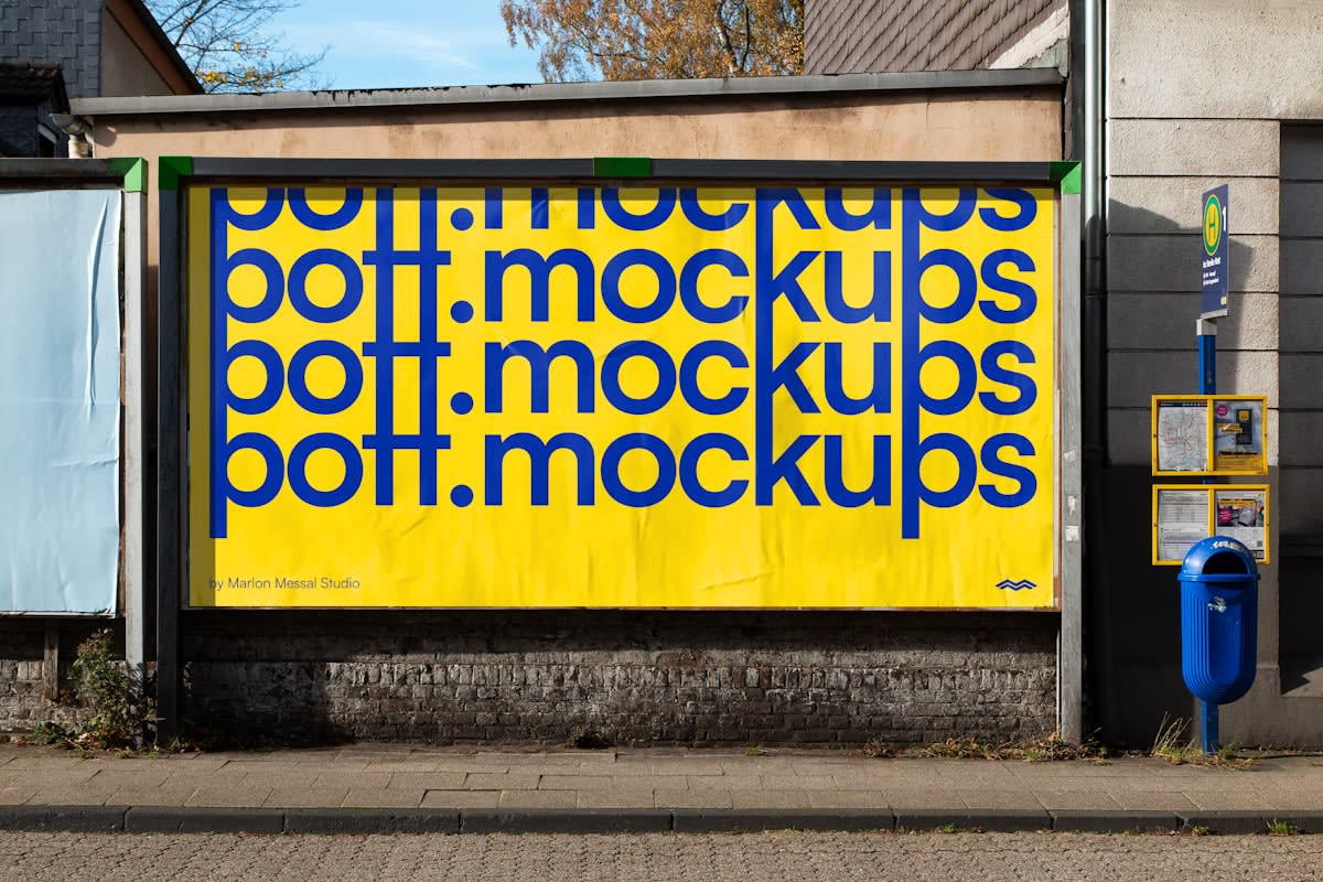
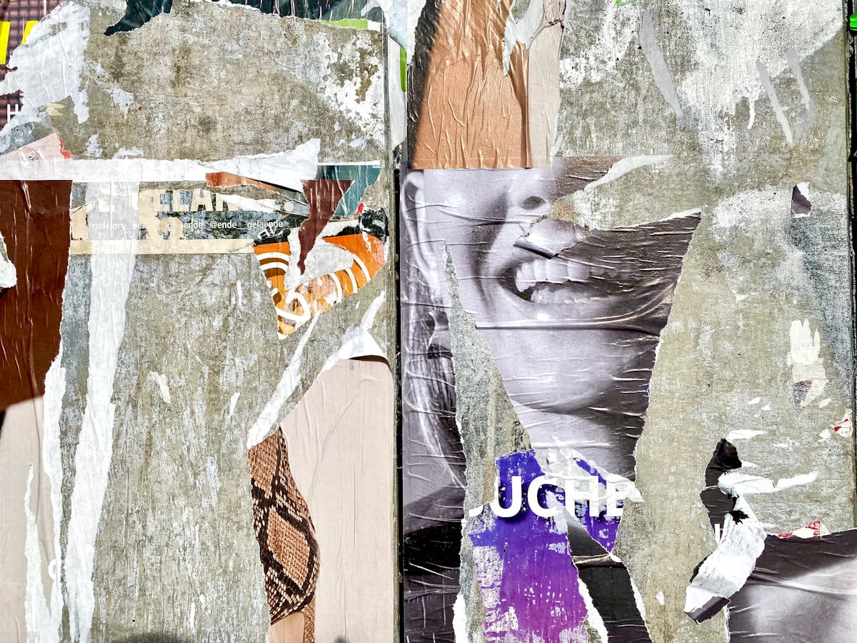
Why does this matter for the broader design landscape? Because the 'anti-AI' sentiment is manifesting as a design language. We are seeing a resurgence of grunge aesthetics, Y2K chaos, and maximalism (Source: Taushik Alam, 2026). These styles prioritize raw energy over balanced composition. They embrace the 'glitch,' the off-center text, and the clashing color palette. By leaning into the 'ugly,' creators are creating a visual shorthand for 'This was made by a person who felt something,' rather than 'This was optimized by a model to maximize engagement.'
The Authenticity Paradox: Measuring the Gap
The pivot toward imperfection is backed by psychological shifts in how we perceive value. A recent study highlights that perceived aesthetics and perceived authenticity are deeply linked to cultural identity and the intention to accept a product or message (Source: Nature, 2026). In a world saturated with synthetic media, the brain begins to associate 'too perfect' with 'fake.' This creates a paradox: the more a brand tries to look professional and polished, the more it may alienate a sophisticated audience that is scanning for signs of human authenticity.
| Design Era | Primary Visual Cue | Psychological Signal | Current Status (2026) |
|---|---|---|---|
| The Glossy Era | Symmetry & Minimalism | Professionalism/Luxury | Seen as 'Synthetic' or 'Corporate' |
| The Ugly Era | Grunge & Maximalism | Authenticity/Rawness | Rising Trust Signal |
| The AI Era | Hyper-realism | Efficiency/Optimization | Triggering 'Uncanny Valley' response |
This trust gap is most evident in the realm of AI-generated content. Research into AI-generated review summaries shows a significant drop in perceived authenticity when there is an inconsistency between the AI's summary and the actual dispersion of user reviews (Source: MDPI, 2026). Specifically, under conditions of inconsistency, perceived authenticity was significantly lower when review dispersion was low (MLow RD = 2.987) compared to when it was high (MHigh RD = 3.927) (Source: MDPI, 2026). This suggests that users are becoming expert detectors of 'smoothed over' data. They don't want a perfect summary; they want the messy, contradictory truth of human experience.
Does this mean we are abandoning quality? Not at all. It means we are redefining quality as 'honesty.' The goal is no longer to hide the seams of production but to highlight them. Whether it is a musician using a 'fail' edit to hook an audience (Source: johnshrimpnose, 2026) or a brand using a brutalist website layout, the intent is the same: to prove that a human was in the room when the decision was made.
The Practitioner's War: Friction vs. Seamlessness
On the ground, this shift is causing a civil war in design agencies. For years, the gold standard was 'frictionless' UX—removing every possible hurdle between the user and the purchase. But practitioners are now debating the 'Value of Friction.' In internal strategy meetings, the conversation has shifted from 'How do we make this easier?' to 'How do we make this feel real?' Designers are intentionally introducing 'analog' elements—grainy textures, hand-drawn annotations, and non-linear navigation—to slow the user down and force a moment of genuine connection.
Look at the emerging content strategies of independent creators. Instead of high-production value videos, many are pivoting to 'lo-fi' and 'hopecore' edits. One independent musician has explicitly used a psychological hook regarding short attention spans, pairing their music with meme-style 'fail' content to bypass the viewer's skepticism of polished ads (Source: johnshrimpnose, 2026). This is a calculated move. By presenting as 'unprofessional,' the creator lowers the viewer's defenses, making the eventual delivery of the art feel like a discovery rather than a sales pitch.
- Maximalism: Moving away from 'clean' lines to crowded, energetic compositions.
- Bento Grids: A structured but modular approach that allows for diverse, non-uniform content (Source: Taushik Alam, 2026).
- Grunge Resurgence: The use of distressed textures and 'dirty' typography to evoke a pre-digital feel.
- Y2K Aesthetics: A nostalgic embrace of the early internet's clunky, experimental visuals.
Comparing the current landscape to 12 months ago, the 'Delta' is staggering. Last year, AI was a tool for efficiency; this year, it is a catalyst for a counter-culture. The trend has moved from 'AI-assisted design' to 'Anti-AI aesthetics.' We are no longer just using tools to make things look better; we are using tools to make things look more humanly flawed. This is the new frontier of brand loyalty: the courage to be ugly.
Editorial Note
This article is written from the perspective of a global news anchor monitoring the intersection of tech and art. The analysis blends real-time street trends in San Francisco with academic data on authenticity and consumer psychology to illustrate a systemic shift in global design values.
Fact-Check & Accuracy Note
Key claims regarding anti-AI graffiti are sourced from The San Francisco Standard (2026). Authenticity metrics and AI review data are sourced from MDPI (2026) and Nature (2026). Design trends for 2026 are attributed to industry observations by Taushik Alam. The debate over 'friction' in UX is a synthesis of current professional practitioner discourse.