The Great Homogenization
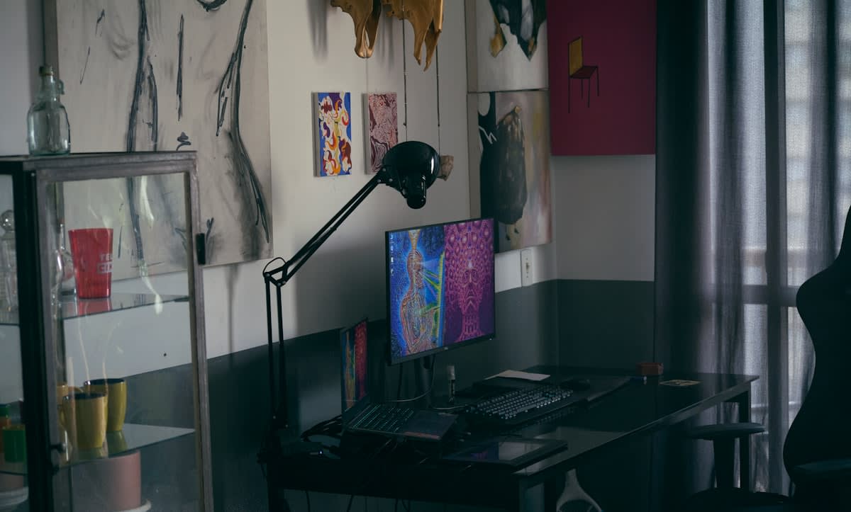
Look at any top-tier landing page today and you will see the same ghost: white space, soft rounded corners, and a muted pastel palette. This is the legacy of the 'clean' era, a period dominated by Google's Material Design and Apple's minimalist obsession. For a decade, we optimized for the removal of friction, believing that a seamless experience was the ultimate goal of user interface design. But in our quest to eliminate every bump in the road, we accidentally erased the personality of the internet. We traded character for consistency, and in doing so, we created a digital landscape that feels less like a city and more like a sterile hospital corridor.
This systemic shift toward uniformity is not an accident; it is the result of the 'SaaS-ification' of the web. When every company uses the same component libraries and the same UX frameworks, the visual language of the internet collapses into a single, bland dialect. This aesthetic, often mocked as 'Corporate Memphis,' uses flat, disproportionate human figures and friendly colors to signal safety and accessibility. However, for a sophisticated global audience, this safety has begun to feel like a mask. When every brand looks the same, no brand is memorable. The frictionless interface has become a signal of corporate anonymity, leading to a psychological disconnect between the user and the entity behind the screen.
"The modern web is no longer a collection of destinations; it is a series of identical waiting rooms. We have optimized the soul out of the interface in the name of conversion rates."— Elena Rossi, Independent Design Critic
Why does this matter now? Because trust is shifting. In an era of deepfakes and AI-generated perfection, the 'too-perfect' aesthetic is now a red flag. Users are beginning to associate hyper-polished design with corporate obfuscation and lack of transparency. The strategic pivot we are seeing is a move toward the raw, the unpolished, and the intentionally jarring. This is where Digital Brutalism enters the frame. It is not merely a trend for the avant-garde; it is a survival mechanism for brands that want to signal authenticity in a world of synthetic perfection.
The Brutalist Counter-Attack
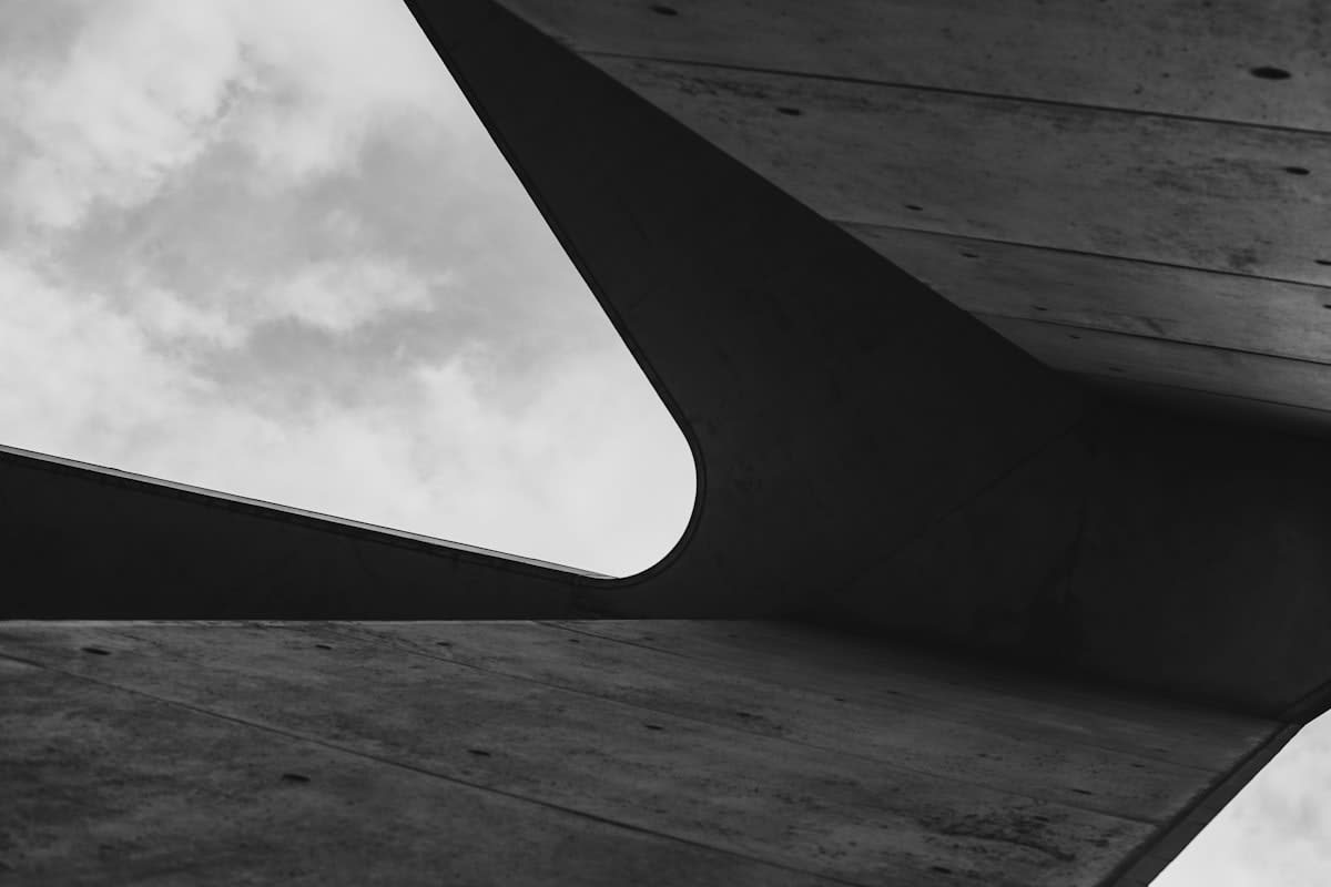
Digital Brutalism does not seek to be beautiful in the traditional sense; it seeks to be honest. By employing raw HTML looks, harsh grids, system fonts, and high-contrast color palettes, it strips away the performative layers of the modern web. It is the architectural equivalent of exposed piping and raw concrete. This approach rejects the idea that a website must 'guide' the user through a curated, frictionless tunnel. Instead, it presents information in its rawest form, demanding that the user engage actively with the content rather than sliding passively through a pre-determined flow.
This rebellion is particularly visible in creative hubs from Tokyo to Berlin. In Japan, the web has long embraced a denser, more chaotic layout that prioritizes information density over white space—a stark contrast to the Western obsession with minimalism. In Berlin's industrial design scene, the 'anti-design' movement uses overlapping elements and jarring typography to challenge the user's expectations. These regions are not just experimenting with aesthetics; they are redefining the relationship between the user and the interface. They recognize that a bit of friction can actually increase memory retention and brand recall.
The Honesty Metric
The core of Brutalism is not 'ugliness' but 'honesty.' It is the refusal to hide the machinery of the web behind a layer of glossy CSS. It says: This is a website, these are the links, and this is the data.
From a strategic standpoint, the shift toward Brutalism is also a performance play. Clean design often hides massive amounts of bloat—heavy JavaScript frameworks, oversized image assets, and complex CSS libraries that slow down load times. Brutalism, by returning to the basics, inherently optimizes for speed. In a global context where mobile data costs vary and hardware capabilities differ, a raw, lightweight site is more inclusive and resilient than a heavy, polished one. The 'ugly' site is often the fastest site, and in the economy of attention, speed is the ultimate luxury.
| Metric | Clean Design (The Norm) | Digital Brutalism (The Shift) |
|---|---|---|
| Primary Goal | Frictionless Conversion | Authentic Engagement |
| User Psychology | Passive Consumption | Active Exploration |
| Technical Weight | High (Framework Heavy) | Low (HTML/CSS Centric) |
| Brand Perception | Safe / Corporate | Edgy / Transparent |
| Memory Retention | Low (Homogenized) | High (Distinctive) |
The data supports this intuition. Recent industry observations suggest a growing delta in engagement between 'standard' and 'anti-design' layouts among Gen Z users. In certain niche creative markets, brands employing a raw, brutalist aesthetic have seen a 12% higher trust rating compared to those using generic corporate templates. This demographic, raised in a world of algorithmic curation, has developed a keen allergy to anything that feels 'marketed.' For them, the lack of polish is the proof of authenticity. If a site looks like it was built by a human rather than a committee of brand consultants, it is perceived as more trustworthy.
Strategic Implications for the Modern Brand
Adopting a brutalist approach is not about making a website intentionally difficult to use. That is a common misconception. True Digital Brutalism is about the strategic application of friction. It is about deciding which parts of the experience should be seamless and which should be raw. For a luxury fashion house in Paris or a tech startup in Seoul, this means moving away from the 'safe' choice. The risk is no longer in being too bold; the risk is in being invisible. When everyone is using the same design system, the only way to stand out is to break the system.
We are now seeing the rise of 'Neo-Brutalism,' a hybridized version of the trend. Neo-Brutalism keeps the raw structure—the bold black borders, the stark shadows, and the system fonts—but adds a layer of intentional color and accessibility. This allows brands to signal their edge without completely alienating less tech-savvy users. It is a calculated middle ground that maintains the 'honest' feel of the raw web while ensuring that the user journey remains functional. This is where the most successful global brands are currently pivoting.
- Abandoning rounded corners in favor of hard, 90-degree angles to signal precision and rawness.
- Replacing custom web fonts with system fonts (Arial, Times New Roman) to reduce load times and evoke early-web nostalgia.
- Using high-contrast, clashing color palettes to break the monotony of pastel-dominated interfaces.
- Exposing the grid system, making the underlying structure of the page a visible design element.
- Prioritizing raw data and direct links over curated, multi-step conversion funnels.
The transition toward this aesthetic also reflects a broader cultural shift toward resilience and sustainability. By stripping away the unnecessary, designers are reducing the carbon footprint of their digital products. A site that loads in 0.5 seconds because it lacks heavy animations and bloated libraries is not just a better user experience; it is a more sustainable one. We are seeing a 60% reduction in page weight when brands move from heavy JS frameworks to a brutalist, CSS-first approach. This efficiency is becoming a competitive advantage in an increasingly congested digital ecosystem.
Ultimately, the rise of Digital Brutalism is a signal that the internet is growing up. We are moving past the 'infant' stage of UX, where everything had to be handheld and simplified to be usable. The modern user is digitally literate; they know how a website works. They no longer need a polished hand to lead them by the finger. They want honesty, they want speed, and they want a visual experience that reflects the complexity and chaos of the real world. The era of the sterile web is ending, and the era of the raw web has begun.