
We have been lied to about the relationship between beauty and trust. The industry default suggests that a polished, symmetrical, and 'modern' interface signals professionalism and reliability. It is a fallacy. In reality, over-polished design often creates a psychological bottleneck, signaling a corporate facade that masks functional failure. When a user encounters a site that looks like a million-dollar template but fails to deliver a simple result, the trust collapse is violent. Why do we continue to prioritize the paint over the engine?
The Mechanical Failure of Polished UI
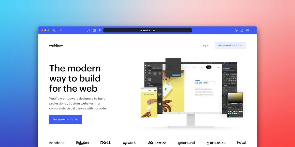
The friction occurs in the gap between User Interface (UI) and User Experience (UX). UI focuses on the appearance and behavior of buttons, layouts, and how forms communicate (Source: Kent State University, 2026). UX is the broader web of research, interaction design, and efficiency. When the UI is too perfect, it creates an expectation of seamlessness that the underlying UX often cannot meet. This collision between high visual expectation and low functional delivery is where trust dies. A 'beautiful' app that requires too many steps to complete a simple task isn't just inefficient; it is deceptive.
This isn't just a design preference; it's how our brains process visual representations. Cortical architecture captures these representations across a lifespan, meaning our expectations of how a tool should behave are deeply ingrained in our neural wiring (Source: eLife, 2026). When a design feels 'too perfect,' it can trigger a subconscious override, signaling that the product is a marketing exercise rather than a tool. Raw, 'ugly,' or utilitarian design removes this layer of suspicion. It tells the user: the effort went into the utility, not the lacquer.
Practitioner's Insight: The Studio War
The internal war in most design studios is a battle of egos. The Visual Designer fights for the 'wow' factor—the gradients, the micro-interactions, the whitespace. Meanwhile, the UX Researcher is screaming that the user can't find the 'Submit' button because it's a subtle, aesthetically pleasing shade of grey. This friction is where most products fail. The 'ugly' design approach isn't about being sloppy; it's about an intentional override of aesthetic vanity in favor of raw utility.
Prerequisites for Implementing Raw Design
Before you strip away the polish, you must have a foundation of absolute functional clarity. You cannot hide a broken product behind an 'ugly' aesthetic; that is simply bad design. To move toward a trust-based, raw aesthetic, you need a deep understanding of your user's behavioral intentions. Trust is the primary driver of whether a user will actually integrate a tool into their creative or professional process (Source: Frontiers in Psychology, 2026).
- A mapped user journey that prioritizes speed over style (Source: Ford Motor Company, 2026).
- Clear behavioral anchors that define what 'success' looks like for the user.
- A willingness to sacrifice 'brand guidelines' for the sake of cognitive ease.
- Data on where users are currently experiencing friction in the 'polished' version.
How to Build Trust Through Intentional Rawness
Moving from perfection to trust requires a hard turn in your design process. It is not about removing design; it is about redesigning the hierarchy of value. You are shifting the value from the visual style to the semantic content.
- Audit for 'Vanity Polish': Identify every element in your UI that exists solely for aesthetic reasons—gradients, excessive animations, or non-functional decorative images. Remove them.
- Prioritize Semantic Content: Ensure the visual style does not overshadow the actual information. In expert evaluations, semantic content and spatial composition are critical markers of legitimacy (Source: Frontiers in Psychology, 2026).
- Introduce 'Honest Friction': Instead of trying to hide every step of a process, make the steps visible. This mirrors the 'human' element of work, making the tool feel like a partner rather than a black-box algorithm.
- Translate Problems into Flows: Stop designing screens and start designing journeys. Map the customer's problem directly to a solution flow, ignoring the temptation to 'beautify' the transition (Source: Ford Motor Company, 2026).
- Validate via Blind Expert Review: Use reviewers who are blinded to the brand to score the utility. If the 'ugly' version scores higher on semantic clarity than the 'pretty' one, you have found your edge.
"Trust in GenAI showed the strongest direct association with behavioral intention (β = 0.425, p < 0.001)."— Frontiers in Psychology, 2026
This statistic is the heartbeat of the raw design movement. It proves that the willingness to use a tool is not driven by how much we like the interface, but by how much we trust the system's legitimacy. In the context of generative AI and art, the social influence of role models and the perceived authenticity of the practice outweigh superficial polish (Source: Frontiers in Psychology, 2026). If a tool looks too perfect, it feels fake. If it looks like a tool—complete with the grit and friction of a real workspace—it feels authentic.

Common Pitfalls in Raw Design
There is a dangerous overlap between 'intentional raw design' and 'lazy design.' The former is a disciplined choice; the latter is a failure of execution. The biggest bottleneck is usually the 'Lack of Hierarchy' trap. When you remove the polish, you risk removing the signposts that tell a user where to look. Ugly design must still be legible.
- The 'Sloppy' Trap: Confusing the absence of decoration with the absence of structure.
- The 'Over-Simplification' Error: Removing necessary UI cues in a quest for raw minimalism, leading to navigation confusion (Source: Kent State University, 2026).
- The 'Brand Ego' Collision: Implementing raw design while still trying to adhere to a corporate style guide that demands 'premium' aesthetics.
Fact-Check & Accuracy Note
The data analyzed from the Human Connectome Project and other neurological studies suggests that our visual processing is highly sensitive to structural gradients (Source: eLife, 2026). If you remove the polish but destroy the structural gradient of your information, you aren't building trust—you're building a headache. Keep the structure; kill the decoration.
Ultimately, the edge goes to the practitioner who understands that trust is an emotional response to functional honesty. When we stop trying to trick the user into thinking the product is perfect, we open the door for them to actually use it. The goal is not to be ugly for the sake of being ugly. The goal is to be so useful that the beauty becomes irrelevant.