The Great Beige Exodus
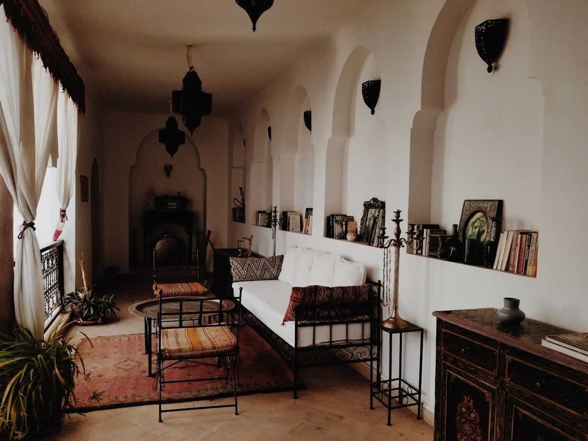
The beige era did not just fade; it crashed. For nearly a decade, the global design aesthetic was dominated by a sterile, muted palette—often derisively called 'sad beige'—that prioritized neutrality over personality. We lived in a vacuum of oatmeal tones and bouclé fabrics that felt more like a high-end airport lounge than a home. But the pendulum is swinging back with violent intensity. Minimalism has finally been asked to leave the room, and it is taking its ubiquitous sad beige bouclé chair with it (Source: Prestige Online, 2026). This is not merely a change in color preference; it is a psychological reclamation of the domestic space.
Why now? The shift signals a move toward resilience and emotional stimulation. After years of clinical minimalism, homeowners are no longer seeking a sanctuary that looks like a void. Instead, they are chasing 'Dopamine Decor'—the intentional use of vibrant colors, clashing patterns, and nostalgic objects to trigger happiness. This transition represents a fundamental pivot from design that seeks to disappear to design that demands to be seen. The current appetite is for rooms that tell a story, even if that story is chaotic, loud, and unapologetically eclectic.
"Minimalism has finally been asked to leave the room, and it's taking its sad beige bouclé chair with it."— Editorial Analysis, Prestige Online
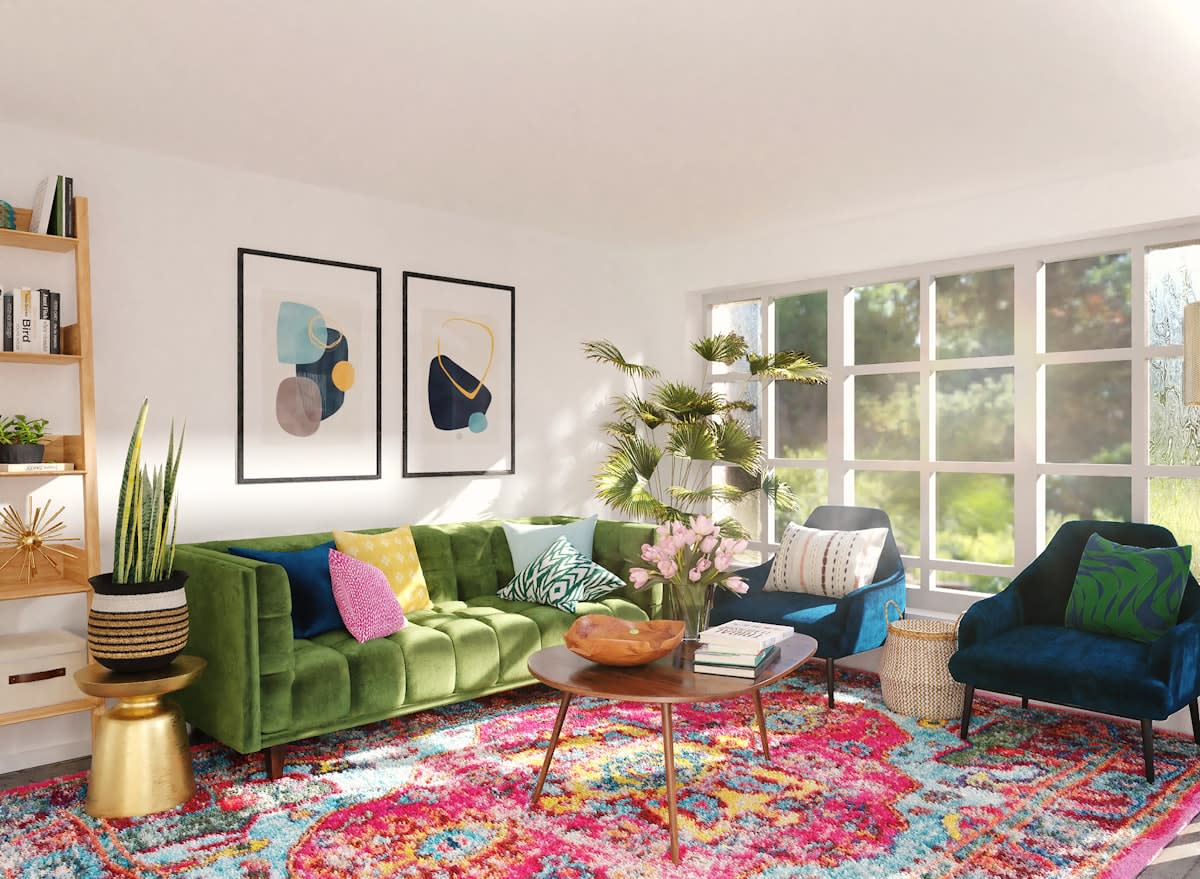
This movement is gaining traction globally, manifesting differently across regions but sharing a common core of rebellion. In urban centers from Tokyo to Mexico City, the rejection of the 'global gray' aesthetic is evident. We see a surge in the mixing of heritage textiles with neon accents, a direct defiance of the curated, 'Instagram-perfect' neutrality that defined the 2010s. The goal is no longer to create a space that looks like a showroom, but to create a space that feels like a biography.
Decoding the Pattern Sandwich
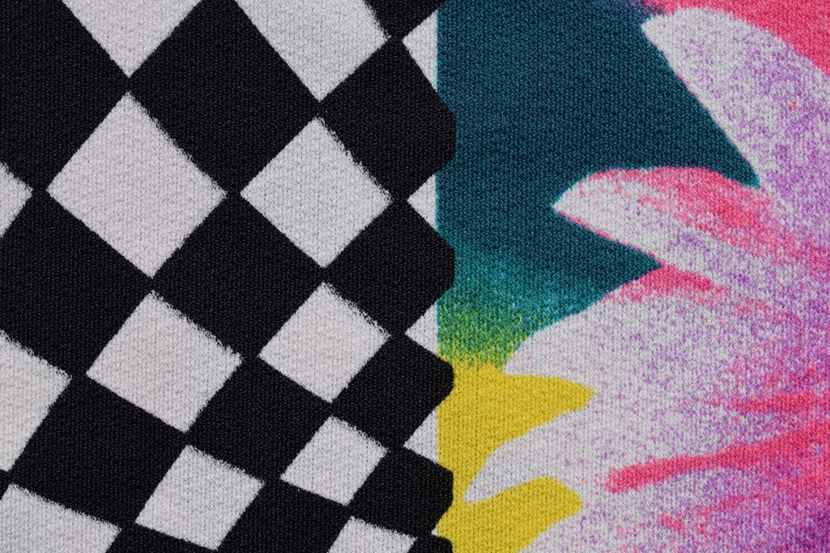
At the forefront of this maximalist revival is a specific styling technique known as the 'pattern sandwich.' This trend is currently rewriting the rules of both fashion and interior decor (Source: Prestige Online, 2026). The logic is simple yet daring: layering contrasting patterns in a way that creates a cohesive, albeit complex, visual harmony. Rather than following the old rule of having one 'statement' piece surrounded by neutrals, the pattern sandwich encourages multiple statements to coexist. Imagine a striped rug, a floral sofa, and a geometric wallpaper—layered and stacked to create a rich, textural depth.
This approach requires a level of confidence that minimalism explicitly discouraged. It asks the inhabitant to embrace visual friction. The 'sandwich' refers to the layering process—placing a bold pattern atop another, then 'capping' it with a third, often complementary but distinct, motif. This creates a sense of abundance and warmth, moving away from the cold, echoing spaces of the previous decade. It is a celebration of the 'more is more' philosophy, where the chaos is the point.
The transition from 'sad beige' to the 'pattern sandwich' marks a shift in how we perceive luxury. Luxury is no longer defined by the absence of clutter or the purity of a single tone; it is now defined by the ability to curate chaos. It is the difference between a hotel room and a home. This evolution suggests that we are entering an era of 'curated maximalism,' where the focus is on the joy of collection rather than the discipline of subtraction.
The Digital Canvas: Tech as Art
Even our technology is adapting to this anti-minimalist surge. For years, the television was the 'black hole' of the living room—a giant, dead rectangle of glass that disrupted any design attempt. The emergence of 'art TVs' is a direct response to the desire for integrated, aesthetic-driven living. The Samsung Frame Pro, for instance, is designed to function as wall decor when not in use, allowing users to display a rotating selection of artwork from a dedicated art store (Source: The Guardian, 2026).
The Frame Pro's ability to incorporate elements like antique gold bezels transforms a piece of consumer electronics into a design statement (Source: The Guardian, 2026). This allows the user to hang a Monet in 4K, blurring the line between a tech product and a gallery piece. In a Dopamine Decor context, this means the TV is no longer a compromise; it becomes another layer in the pattern sandwich, a dynamic element that can change its mood and color palette to match the room's evolving energy.
| Feature | The 'Sad Beige' Era | The Dopamine Decor Era |
|---|---|---|
| Color Palette | Oatmeal, Greige, White | High-contrast, Neon, Jewel Tones |
| Core Philosophy | Subtraction & Neutrality | Addition & Emotional Stimulation |
| Key Furniture | Bouclé Chairs, Minimalist Sofas | Pattern-layered textiles, Eclectic finds |
| Role of Tech | Hidden or 'Black Hole' TVs | Integrated Art-TVs (e.g., Frame Pro) |
| Vibe | Sterile, Calm, Hotel-like | Vibrant, Personal, Narrative |
The Practitioner's Friction: Curated vs. Cluttered
On the ground, this shift is creating a fascinating tension among interior designers. In the studio, the debate has moved from 'how do we make this disappear?' to 'how do we prevent this from becoming a mess?' There is a thin line between a successful pattern sandwich and a visual headache. Professionals are currently grappling with the 'friction' of maximalism—the challenge of guiding clients who want 'everything' but still want the space to feel intentional.
The real-world struggle is often about scale and saturation. Designers are finding that while clients are exhausted by beige, they often lack the confidence to commit to a full-spectrum palette. The practitioner's role has evolved into that of a 'curator of chaos,' helping clients navigate the risks of high-contrast design. The internal industry debate now centers on whether this is a fleeting reaction to a decade of minimalism or a permanent shift toward a more human-centric, emotionally driven approach to space.
Furthermore, the integration of digital art has added a new layer of complexity. Designers are no longer just picking fabrics; they are programming 'art rotations' for screens to ensure the digital content complements the physical patterns in the room. This convergence of interior design and digital curation is the new frontier of the industry, turning the home into a living, breathing installation.
Editorial Note
This trend represents a move toward 'Emotional Ergonomics'—designing spaces not just for physical comfort, but for psychological uplift. The rejection of beige is, in essence, a rejection of emotional numbness in our surroundings.
Fact-Check & Accuracy Note
Key claims regarding the 'pattern sandwich' and the decline of 'sad beige' are sourced from Prestige Online (2026). Details regarding the Samsung Frame Pro and its role as wall decor are sourced from The Guardian (2026). The broader shift toward 'Dopamine Decor' is an industry-wide observation based on these reported trends.