
We have been told for a decade that the pinnacle of design is frictionlessness. The goal was always a seamless user experience, a perfectly blended complexion, and a visual language that vanishes into the background of utility. But what happens when the 'seamless' becomes a sterile void? We are witnessing a systemic rejection of the flawless. The current global appetite for 'ugly design'—characterized by brutalist layouts, clashing palettes, and raw, unpolished edges—is not a regression in taste. It is a sophisticated response to the uncanny valley of digital perfection.
The driver of this shift is the feedback loop of generative AI. In the beauty and aesthetics sector, AI is no longer just retouching images; it is predicting outcomes. Tools like SkinGPT, developed by Haut, allow consumers to visualize specific improvements in their skin, turning abstract percentages into concrete imagery (Source: The Interline, 2026). When a consumer can see the exact difference between a 21% and a 25% improvement in wrinkles, the standard for 'perfection' shifts from a goal to a requirement. This precision creates an intellectual tension: if the machine can render the perfect version of us, the imperfect, raw version becomes the only remaining site of authenticity.

The Precision Fatigue: From Cockpits to Canvas
This exhaustion with perfection isn't limited to the mirror; it extends to how we navigate the physical and digital world. Consider the current trajectory of high-precision utility. Garmin has recently expanded its guided visual approaches for challenging airports, including new procedures in Mexico, to help pilots maintain stabilized approaches amidst complex cityscapes and terrain (Source: Aviation International News, 2026). While this is a triumph of safety and engineering, it represents the peak of 'curated reality.' When every visual cue is optimized and every path is pre-calculated, the human psyche begins to crave the unplanned.
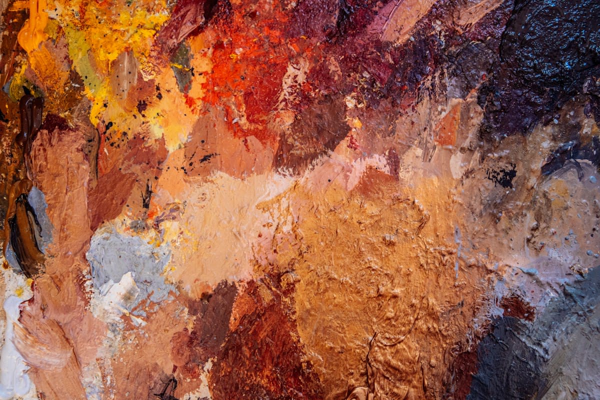
We see this tension playing out in the fine arts, where the focus is shifting back to the 'construction' of space rather than the 'representation' of it. In Toronto, the Oeno Gallery's exhibition 'Constructing Space' highlights five Canadian abstract painters who treat color as a structural element rather than a decorative one (Source: Artnet News, 2026). Artists like David Sorensen interrogated the boundaries between surface and physical depth through meticulously layered surfaces. This is the artistic equivalent of anti-design: a move away from the 'flat' perfection of the digital screen and a return to the tactile, layered, and sometimes awkward reality of physical materials.
"There’s a problem in the beauty and aesthetics industry: it’s never agreed on its own vocabulary. It’s not only a problem in fashion."— Expert source cited in The Interline, 2026
Why does a lack of shared vocabulary matter? Because when the industry cannot define 'beauty' without relying on AI-generated deltas, the definition becomes hollow. The 'ugly' movement is an attempt to reclaim that vocabulary. By intentionally choosing clashing colors or non-linear layouts, designers are creating a new language that AI cannot yet simulate because it lacks the human capacity for intentional 'wrongness.'
The Identity Marker: Aesthetics as Activism
Design is never just about looks; it is about signaling. We are seeing a convergence between aesthetic choices and political identity. Recent data suggests that consumer activism is now a year-round tool, with shoppers increasingly using their spending habits to align with their personal identities (Source: Newsweek, 2026). This 'intention-behavior gap' is closing as consumers move away from brands that feel like corporate monoliths. In the same way, users are abandoning 'Corporate Memphis'—that ubiquitous, friendly, flat-illustration style—in favor of aesthetics that feel dissident, raw, or 'ugly.'
When a brand's position reflects a consumer's identity, the aesthetic becomes a badge of membership (Source: Newsweek, 2026). 'Ugly' design serves this purpose perfectly. It signals a rejection of the mass-market, AI-optimized polish of the global elite. It is the visual equivalent of a political boycott: a refusal to participate in a standardized version of 'good taste' that feels imposed by an algorithm.
From a practitioner's perspective, this shift creates a fascinating internal friction within creative agencies. I have sat in rooms where the UX lead argues for a streamlined, high-conversion layout—the 'safe' bet—while the Art Director pushes for a layout that feels 'broken' or 'glitchy' to attract a Gen Z audience. The debate is no longer about usability versus aesthetics; it is about trust. The internal consensus is shifting: we are realizing that a design that is too perfect feels like a sales pitch, while a design with 'human' flaws feels like a conversation.
The Delta of Desire: Comparing the Eras
To understand the urgency of this trend, we must look at the delta between the design priorities of 2020 and 2026. Five years ago, the goal was 'invisible' design—the idea that the interface should get out of the way of the task. Today, the interface is the task. We are moving from the era of the 'Tool' to the era of the 'Statement.'
| Design Element | The 'Flawless' Era (2015-2024) | The 'Anti-Design' Era (2025-Present) |
|---|---|---|
| Visual Goal | Seamlessness & Harmony | Friction & Contrast |
| Primary Tool | Standardized Design Systems | Generative Chaos & Manual Rawness |
| Consumer Signal | Professionalism/Reliability | Authenticity/Identity |
| AI Role | Optimization of Beauty | The Foil (The thing to react against) |
This pivot is not a rejection of technology, but a recalibration of its role. We still use the guided visuals of Garmin to land planes safely, and we still use SkinGPT to understand dermatological progress. However, we no longer want those standards to define our cultural aesthetics. The demand for ugly design is a demand for a space where the machine is not the arbiter of taste.
Fact-Check & Accuracy Note
Key claims regarding AI beauty visualization are sourced from The Interline (2026) and Allergan Aesthetics research. Data on consumer activism and political spending is sourced from Newsweek (2026). Information on aviation visuals is sourced from Aviation International News (2026). The debate regarding 'ugly design' as a psychological reaction to AI is an ongoing discourse among global design critics and is not a settled scientific fact.
Ultimately, the rise of the 'ugly' is a victory for the human element. By embracing the clunky, the structural, and the mismatched, we are carving out a visual sanctuary that cannot be automated. The future of design isn't about finding a new version of perfection; it's about having the courage to be flawed in an era of algorithmic precision.