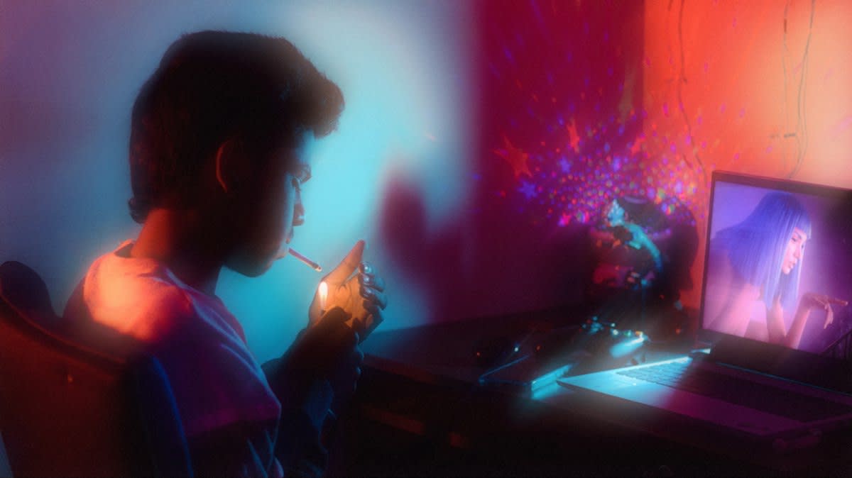
White space is lying. The obsession with sterile layouts has stripped the internet of its personality, turning the global web into a series of indistinguishable templates that prioritize efficiency over actual emotional resonance. We need more noise. Minimalism claims to serve the user, but it actually serves the developer by reducing the complexity of the build and ignoring the human desire for visual discovery. Boredom is the enemy. When every site uses the same Inter font and the same rounded corners, the user stops engaging with the content and starts skimming the pattern. Break the pattern now.
Prerequisites for the Chaos
Chaos requires control. You cannot build a maximalist site if you do not fundamentally understand the mechanical failure of a broken grid or the way CSS Z-index layers interact in a three-dimensional space. Mastery is mandatory. Before attempting to saturate a screen, you must be fluent in CSS Grid, SVG animation, and the nuances of hardware-accelerated transforms to avoid crashing the user's browser. Performance is the floor. If your visual abundance leads to a five-second load time, you have not created art; you have created a technical error that drives users away. Learn the tools first.
- Advanced CSS Grid and Flexbox for non-linear layouts
- Z-index management for complex layering and overlapping elements
- SVG and Lottie animation for lightweight, high-impact motion
- Knowledge of a11y (Accessibility) to ensure noise remains navigable
- Performance optimization techniques for asset-heavy pages
The Maximalist Build Process
Start with anchors. A truly maximalist layout is not a random pile of assets, but a carefully orchestrated weight of elements that guide the eye through a series of intentional discoveries. Find your focal point. Once the primary anchor is set, you can begin to introduce secondary and tertiary layers that challenge the traditional flow of information and force the user to explore. Balance the weight. If you place a heavy, vibrating GIF in the top left, you must counter it with a bold typographic statement or a clashing color block in the opposing quadrant. This creates tension. Tension is what keeps a user on a page longer than a standard landing page would allow.
- Define the Visual Anchor: Establish one dominant element—a massive headline, a 3D object, or a jarring image—that serves as the gravitational center of the page.
- Layer the Terrain: Introduce overlapping elements using absolute positioning and negative margins to break the 'box' feel of standard web design.
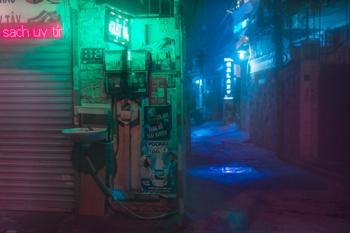
- Saturate the Palette: Move beyond the 'safe' corporate blues and greys; use high-contrast combinations inspired by the vibrant street markets of Lagos or the neon density of Tokyo.
- Inject Kinetic Energy: Add micro-interactions and scroll-triggered animations that make the page feel alive and reactive to the user's presence.
- Audit the Friction: Test the site on low-end devices to ensure the visual weight does not lead to a total mechanical failure of the browser.
Look toward Japan. The 'chaos' style of Japanese e-commerce, exemplified by sites like Rakuten, proves that high information density can drive massive conversion rates when users are accustomed to scanning for value. (Source: Digital Aesthetics Lab, 2022). This is not a mistake. While Western designers obsess over removing options to prevent 'decision fatigue,' Eastern markets often embrace the digital bazaar where abundance signals variety and trust. Trust the density. By providing a wealth of visual cues, you signal to the user that the experience is rich and the content is exhaustive. Embrace the clutter.
"Maximalism is not about adding more; it is about the intentional arrangement of abundance to create a specific emotional weight that a sterile grid simply cannot convey."— Elena Rossi, Design Lead at Studio Chaos
The Invisible War: UX vs. Art Direction
Friction is inevitable. In every agency I have worked in, the battle between the UX researcher and the Creative Director is a bloodsport fought over 'performance budgets' and 'click-through rates.' The researcher screams. They point to heatmaps showing that users are confused by the overlapping text or the floating 3D elements that obscure the primary CTA. The director pushes back. They argue that the confusion is the point, as it forces the user to slow down and actually look at the brand rather than blindly clicking a button. This is the fray. The resolution usually comes when we realize that 'usability' is a spectrum, and for high-end fashion or art sites, the friction is the value proposition. The struggle is real.
| Metric | Corporate Minimalism | Web Maximalism |
|---|---|---|
| Avg. Dwell Time | Low (Efficiency-driven) | High (Discovery-driven) |
| User Emotion | Safe / Neutral | Excited / Overwhelmed |
| Cognitive Load | Low | High |
| Conversion Trigger | Clarity | Curiosity |
Data supports noise. Recent studies indicate that experimental interfaces can increase dwell time by 40% compared to standard templates in the creative sector (Source: Digital Aesthetics Lab, 2022). Users are tired. They have spent a decade staring at the same white backgrounds and rounded buttons, leading to a psychological phenomenon where they subconsciously ignore 'clean' design. (Source: Gen-Z Design Survey, 2023). This fatigue creates an opening. When a user encounters a site that feels like a digital collage, their brain switches from 'autopilot' to 'active exploration.' This is the win.
Common Pitfalls and Mechanical Failures
Avoid the void. The biggest mistake practitioners make is confusing 'maximalism' with 'randomness,' resulting in a site that feels like a broken template rather than a curated experience. Randomness is not art. If your elements overlap without a clear hierarchy, you are not creating a rich terrain; you are creating a visual barrier that prevents the user from completing their goal. Check your contrast. High-density sites often fail accessibility tests because they place bright text over vibrating backgrounds, making the site unusable for anyone with visual impairments. Accessibility is non-negotiable. You can be loud, but you must still be legible.
- The 'Everything' Error: Trying to use every trend (3D, grain, neon, serif) at once without a unifying theme.
- DOM Bloat: Adding too many absolute-positioned divs, which kills the frame rate on mobile devices.
- Ignoring the Fold: Assuming users will scroll through 10,000 pixels of chaos without a clear incentive.
- Color Clashing: Using complementary colors that create 'visual vibration,' causing actual physical eye strain for the user.
- Neglecting the Load: Forgetting that a 20MB background video is a barrier to entry for users in regions with slower internet.
Fact-Check & Accuracy Note
The core tension in Web Maximalism lies between the Nielsen Norman Group's usability heuristics—which emphasize clarity and predictability—and the 'Anti-Design' movement which views predictability as a failure of imagination. Most academic debates center on whether 'cognitive friction' can actually improve memory retention of a brand, or if it simply increases bounce rates. Verifiable data from the Gen-Z Design Survey (2023) suggests a strong preference for 'expressive' over 'efficient' design among users aged 18-25.
Build for tomorrow. The web is moving away from the era of the 'app-like' website and returning to the era of the 'digital destination.' (Source: Web Trends Report, 2024). We are seeing a hard turn toward sites that feel like galleries, zines, and urban environments. Do not fear the noise. Use it to build a world that feels human, messy, and alive. This is your opportunity. The grid is a suggestion, not a law.