
Prerequisites for the Visual Audit
Before initiating a devaluation audit, you must establish a baseline of your current visual currency. Most brands mistake their brand guidelines for their actual visual identity. The guidelines are the map; the identity is the territory as perceived by the consumer. To determine if your assets are susceptible to synthetic devaluation, you need a comprehensive inventory of every touchpoint where a customer interacts with your imagery, from high-fidelity hero shots to the mundane iconography of a mobile app. Why does this matter? Because synthetic media does not attack the logo; it attacks the 'vibe'—the subtle arrangement of light, texture, and composition that creates subconscious trust.
- A complete archive of the last 24 months of brand imagery (social, web, print).
- Access to current-state generative models (Midjourney v6, DALL-E 3, Stable Diffusion XL) for replication testing.
- A 'Visual DNA' document that defines the non-negotiable elements of your aesthetic (e.g., specific grain, lighting angles, color ratios).
- Competitor visual benchmarks to identify 'category drift'—where everyone in the industry starts looking like the same AI prompt.
The core objective here is to identify 'prompt-ability.' If a junior designer at a rival firm can replicate your brand's visual essence using three descriptive keywords, your visual equity is effectively zero. We are seeing this play out in real-time across the fintech sectors in Bangalore and Hyderabad, where a sea of 'modern, clean, blue-gradient' interfaces has rendered individual brand identities invisible. When the cost of producing a high-fidelity image drops to near zero, the value of that image is no longer in its execution, but in its scarcity and its human origin.
The Replication Stress Test
- Select five flagship images that define your current brand identity.
- Use a vision-to-text tool (like Midjourney's /describe) to extract the prompt descriptors the AI associates with your imagery.
- Run those extracted prompts through three different generative models to see how closely the output mimics your brand's specific mood, lighting, and composition.
- Attempt to 'prompt-engineer' a new asset that looks like it belongs in your brand library without using any existing brand assets as a reference.
- Grade the results on a scale of 1-10: A score of 8+ indicates high devaluation risk, meaning your style is too generic or 'AI-native' to provide a competitive advantage.
Does the AI-generated version feel 'correct' but soulless? That is the danger zone. Synthetic media excels at the 'average' of all beauty. It produces a polished, hyper-real sheen that is mathematically pleasing but emotionally vacant. If your brand relies on this 'perfect' aesthetic, you are competing in a race to the bottom. The most resilient brands are those that embrace intentional imperfection—the slight blur of a handheld camera, the uneven texture of handmade paper, or the idiosyncratic lighting of a specific geographic location. These are the 'analog anchors' that synthetic media struggles to replicate without looking like a caricature.
Analyzing Materiality and Texture
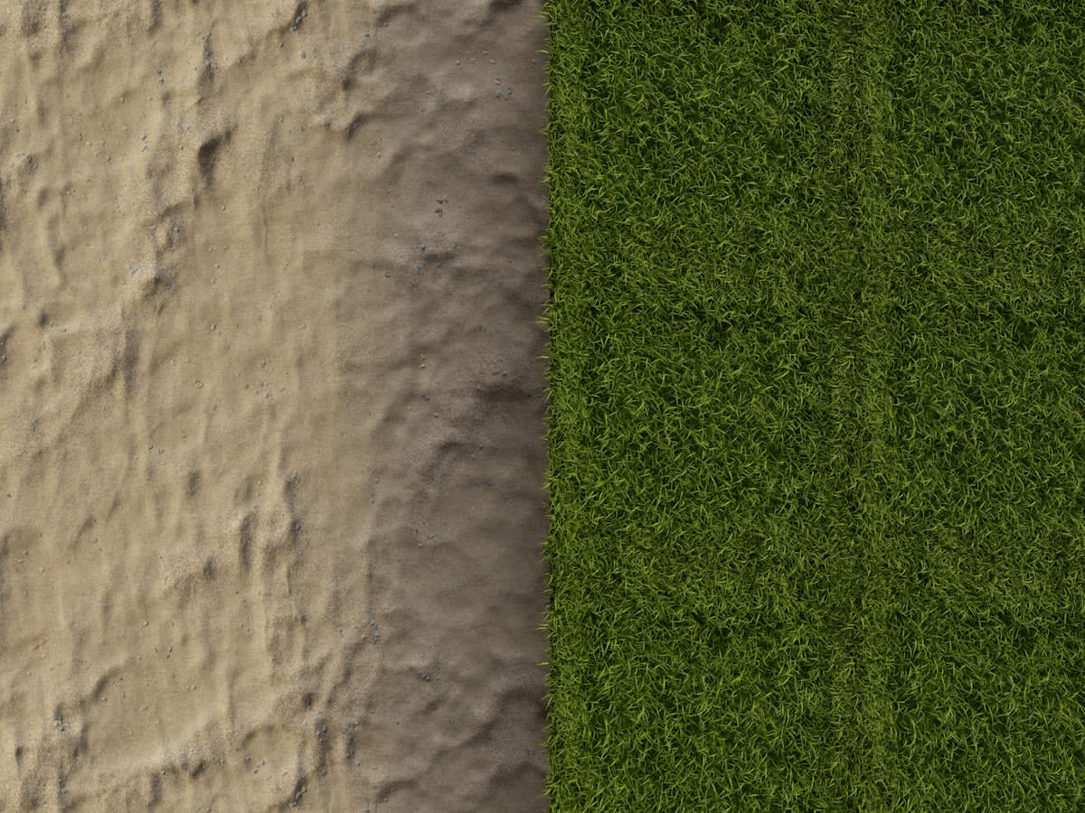
One of the fastest ways to identify synthetic devaluation is through the lens of materiality. Generative AI tends to treat surfaces as mathematical planes. It struggles with the chaotic reality of physical matter—the way light scatters through a real piece of frosted glass or the specific way ink bleeds into 300gsm cotton paper. Audit your assets for these 'material truths.' If your imagery looks like it exists in a vacuum, it is easily replaced. By introducing tactile, high-entropy elements into your visual identity, you create a barrier to entry for synthetic replication.
The Entropy Advantage
Integrate physical artifacts into your digital workflow. Scan actual fabric, record real ambient noise, or photograph authentic urban decay in your local city. These high-entropy inputs act as a 'visual watermark' that AI cannot synthesize from a text prompt.
Consider the current trajectory of luxury branding in the Indian Subcontinent. High-end labels are moving away from the 'globalized' minimalism that AI mimics so well and are instead doubling down on hyper-local, artisanal textures—hand-loomed silks and regional architectural motifs. This isn't just a stylistic choice; it is a defensive strategy. By tethering the visual identity to a physical, geographic, and cultural reality, they make the cost of synthetic replication prohibitively high, as the AI lacks the specific, localized training data to mimic these nuances accurately.
| Visual Marker | Synthetic Signature (Low Value) | Human-Centric Signature (High Value) |
|---|---|---|
| Lighting | Perfectly diffused, omnidirectional | Directional, high-contrast, flawed |
| Composition | Centered, symmetrical, rule-of-thirds | Asymmetrical, candid, tension-based |
| Texture | Smooth, plasticine, hyper-clean | Grainy, tactile, high-entropy |
| Color | Saturated, neon gradients | Muted, complex, site-specific palettes |
The data suggests a growing 'uncanny valley' of brand aesthetics. Internal industry surveys indicate that while 60% of consumers initially respond well to the polish of AI imagery, that engagement drops by nearly 40% when the imagery is perceived as 'generic' or 'fake' over repeated exposure. This is the devaluation curve. The initial efficiency gain of using synthetic media is eventually offset by a loss in brand trust and recall. The audit must therefore identify where your brand sits on this curve.
Compositional Divergence
Composition is the final frontier of the visual audit. AI models are trained on the 'most likely' arrangement of pixels, which inevitably leads to a regression toward the mean. This results in a pervasive 'centered-subject' bias. When you audit your brand, look for compositional tension. Do your images challenge the eye? Do they use negative space in a way that feels intentional rather than accidental? A brand that relies on standard, centered compositions is essentially handing its visual identity to the AI on a silver platter.

To harden your composition, move toward 'human-error' layouts. This includes using off-kilter angles, overlapping elements that break the grid, and embracing the 'ugly' but authentic. The goal is to create a visual language that feels like it was captured by a person with a specific point of view, rather than generated by a probability engine. If your visual identity feels 'too perfect,' it is a liability.
Common Pitfalls
- Over-correcting into 'lo-fi' aesthetics: Don't mistake 'ugly' for 'human.' The goal is intentionality, not a lack of quality.
- The AI-Washing Trap: Using AI to generate 'human-looking' textures. The AI's version of 'grain' is often a repetitive pattern that is easily spotted by trained eyes.
- Ignoring the Motion Layer: Auditing static images while leaving video to the generic AI-motion generators. Synthetic devaluation happens faster in motion.
- Static Brand Guidelines: Treating your visual identity as a fixed document rather than a living defense system that must evolve as AI models update.