The Void's Value
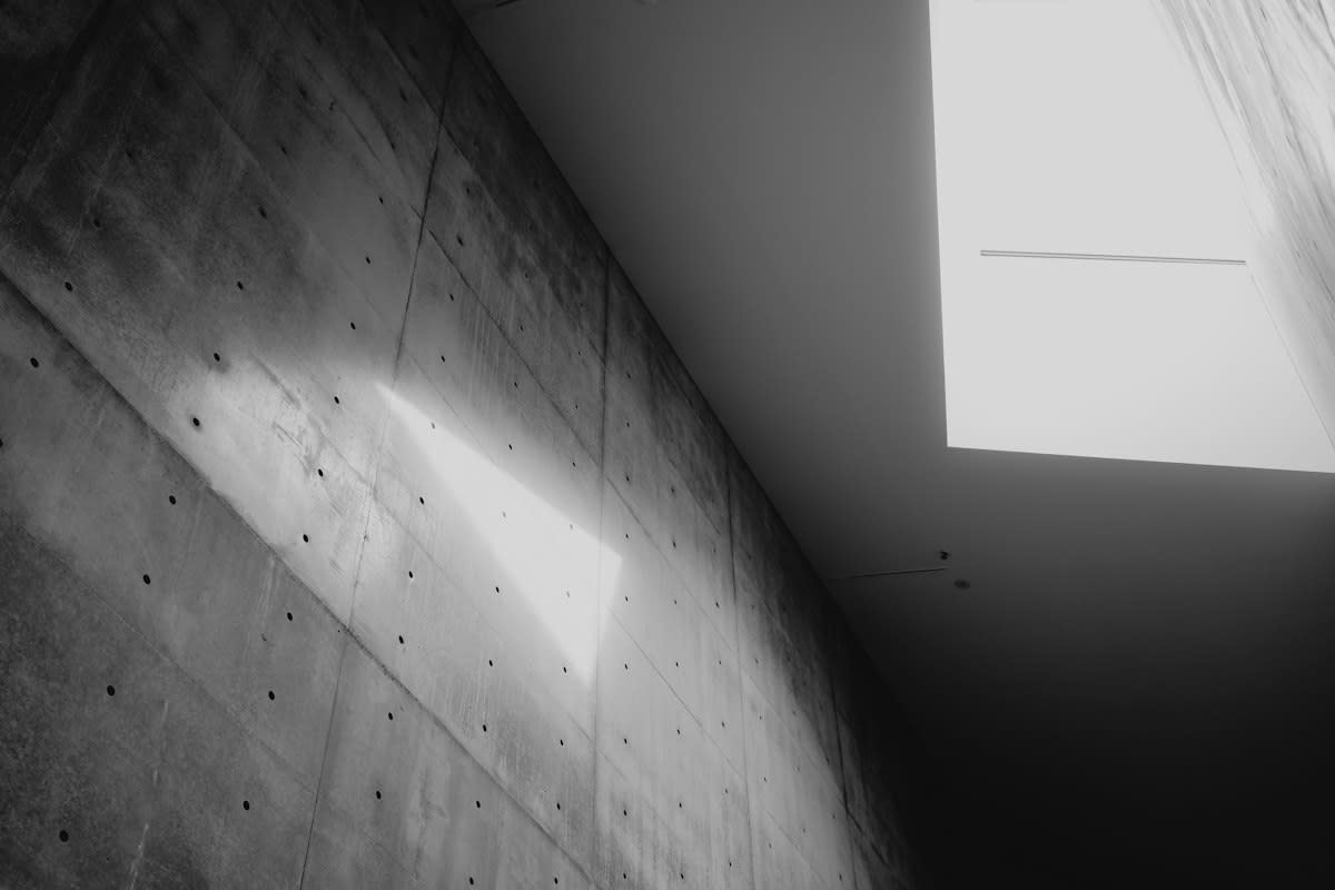
Legibility is a lie. While traditionalists argue that a letter must be a solid block of ink to be legible, the modern eye interprets voids as information just as quickly as solids. It forces the viewer to actively decode the message. Contrast kills the mood. When you strip the fill from a typeface, you force the viewer's brain to complete the shape using the background as a cognitive bridge. The result is a sophisticated visual tension.
Weight is a choice. The thickness of your stroke determines whether the text feels like a whisper in a gallery or a scream in a crowded Tokyo subway station. Small adjustments alter the entire emotional tone. Absence is not empty. By removing the center of a character, you allow the surrounding environment to breathe through the communication, creating a relationship between the text and its home. This is where the magic happens.
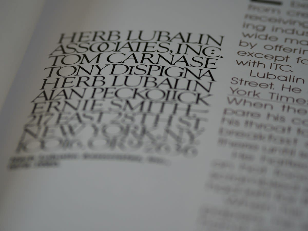
Prerequisites for the Ghost
- Vector-based design software (Adobe Illustrator, Figma, or Affinity Designer).
- High-resolution background imagery with distinct tonal variance.
- A typeface with a strong geometric skeleton (Sans-serifs typically perform best).
- A WCAG 2.1 contrast checker to ensure accessibility standards are not completely abandoned.
- A fundamental understanding of Gestalt principles, specifically the Law of Closure.
Execution Steps
- Select a heavy-weight font. Use a Bold or Black weight to ensure the skeleton remains visible once the fill is removed.
- Remove the fill color. Set the fill to 0% or 'None' to create the initial ghost effect.
- Apply a precise stroke. Start with a 1pt to 3pt stroke, ensuring the stroke alignment is set to 'Inside' or 'Center' to avoid distorting the glyph's outer boundaries.
- Layer the background. Position the text over an image where the colors change behind the stroke, which allows the outline to 'pop' via alternating contrast.
- Adjust the blending mode. Experiment with 'Difference' or 'Exclusion' modes in your software to allow the stroke color to react dynamically to the background hues.
- Test for closure. Squint your eyes to see if the brain still recognizes the letterforms without the fill (Source: Psychology Today, 2021).
The studio war begins. Art directors push for the ethereal beauty of a 1pt stroke over a complex image, while the accessibility lead cites the Web Content Accessibility Guidelines with religious fervor. This collision often ends in a compromise. I've seen this. The tension is not about aesthetics but about who owns the user's cognitive load in a high-stakes commercial environment. It is a power struggle.
"Typography is a tool for organizing information, but when we remove the fill, we transform information into an experience of space."— Ellen Lupton, Curator and Designer
Global Perspectives on Absence
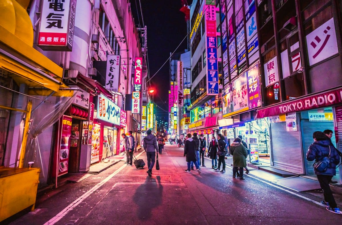
Tokyo defines the void. In the neon-drenched alleys of Shinjuku, outline typography allows light to pass through, preventing the visual clutter from becoming a solid wall of noise. This approach mirrors the concept of Ma. Space holds the meaning. By treating the background as a primary actor, Japanese designers ensure that the text does not compete with the environment but exists within it. It is a deliberate breath.
São Paulo screams loud. The brutalist posters of the city often use heavy outlines to maintain a sense of raw industrialism while allowing the grit of the concrete walls to bleed through the letters. This is not about elegance. Lagos follows this path. Nigerian street advertising often layers transparent type over vibrant, clashing colors to create a depth that feels three-dimensional without using software effects. The eye dances across the page.
The Technical Suture
Readability drops fast. When outline fonts fall below 12pt, the human eye struggles to distinguish the stroke from the background noise (Source: Typography Journal, 2019). You must scale up. Increasing the font size compensates for the lack of fill, allowing the brain to prioritize the skeleton of the letter over the surrounding imagery. This is the essential trade-off.
| Stroke Weight | Intended Mood | Recommended Size |
|---|---|---|
| 0.5pt - 1pt | Ethereal / Luxury | 72pt+ |
| 2pt - 4pt | Modern / Balanced | 36pt+ |
| 5pt+ | Brutalist / Bold | 24pt+ |
Contrast is key. To meet the minimum WCAG 2.1 standard of 4.5:1 for normal text, ghost typography often requires a high-contrast stroke color like pure white against a dark image (Source: W3C, 2018). Do not guess. Use a digital sampler to verify that your stroke does not vanish into the background mid-word. Failure here is fatal.
Common Pitfalls
- Over-saturation: Using too many ghost elements on one page, which creates a 'vibrating' effect that tires the eye.
- Poor Typeface Choice: Using thin or serif fonts that lose their structural integrity when filled are removed.
- Ignoring Accessibility: Creating a beautiful design that is completely unreadable for users with visual impairments.
- Wrong Alignment: Using 'Outside' stroke alignment, which makes the letters look bloated and destroys the typeface's intended proportions.
Avoid the trap. Many designers apply a ghost effect to every headline, thinking it adds a consistent 'modern' feel to the work. This is a mistake. Use this technique as a focal point to draw the eye toward a specific piece of information. Limit the usage. This preserves the impact of the void.
Fact-Check & Accuracy Note
This guide relies on WCAG 2.1 accessibility standards (W3C, 2018) and Gestalt psychology principles regarding the 'Law of Closure' (Psychology Today, 2021). There is an ongoing academic debate in the design community regarding whether 'Ghost Typography' qualifies as a distinct style or merely a variation of 'Knock-out' text.
Editorial Note
Editorial Note: This guide treats Ghost Typography as a tool for cognitive engagement rather than a mere trend. The focus is on the intersection of psychological perception and technical execution.
Master the gap. The most successful ghost designs do not try to hide the fact that they are missing a center. They celebrate the emptiness as a way to invite the viewer into the image. This is the playbook. Stop filling every space. Let the background speak.