
2026. Recent market shifts indicate a dominant trend where luxury in restraint is replacing excess in the spirits sector (Source: The Spirits Business, 2026). This is not an accident of aesthetics but a calculated subtraction. Design houses are stripping away the carbon-scored ornaments of the past to create a vacuum that consumers fill with their own perceptions of quality. The industry is no longer selling the object, but the air around it. This shift moves the value proposition from the tangible weight of the glass to the intangible prestige of the void.
The Mechanics of Restrained Premiumisation
Retailers and distributors are increasingly demanding cleaner layouts and tactile materials over showy maximalism. This movement, termed restrained premiumisation, emphasizes transparency and quality over raw excess (Source: The Spirits Business, 2026). Brands are discarding unnecessary decorations in favor of storytelling that relies on the absence of clutter. This strategy targets a consumer who views a grit-toothed, over-decorated bottle as a sign of insecurity rather than wealth. The result is a visual language where silence is the loudest signal of status.
"Brands are stripping away unnecessary decoration in favour of cleaner layouts, tactile materials, and storytelling. That aligns with wider consumer demand for transparency and quality over excess."— McFarland, Spirits Industry Expert
The material shift is equally aggressive. Heavy, ornate glass is being replaced by lightweight glass and sustainable material choices to meet the demand for reduced packaging (Source: The Spirits Business, 2026). This reduction in mass is marketed as an ethical choice, yet it serves to lower production costs while maintaining a high price point. The consumer pays more for a bottle that weighs less, effectively purchasing the brand's commitment to minimalism. It is a masterful exercise in selling a reduction of product as an increase in value.
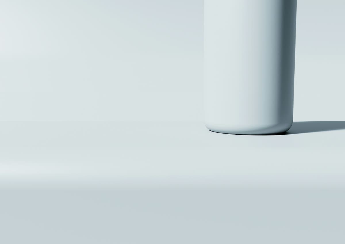
From a practitioner's perspective, this shift creates a violent friction in the design studio. Designers often fight a war of attrition with clients who still equate thickness and gold foil with value. The debate usually centers on whether a neon-burnt, loud label captures attention or whether a vast expanse of white space commands respect. In the current climate, the minimalist approach usually wins, not because it is more beautiful, but because it is perceived as more authentic. The struggle is to find the exact point where a design stops being minimal and starts looking unfinished.
| Design Element | Maximalist Approach | Restrained Premiumisation |
|---|---|---|
| Material Mass | Heavy, thick-bottomed glass | Lightweight, sustainable glass |
| Visual Logic | Ornamentation and excess | Negative space and alignment |
| Consumer Signal | Overt wealth and display | Authenticity and transparency |
| Packaging Goal | Visual dominance | Tactile storytelling |
This logic extends beyond the bottle and into the domestic sphere, where warm minimalism has become a hallmark of the elite. The design of spaces, such as the patio of George and Amal Clooney, demonstrates how minimalist principles can be softened to create a feeling of luxury without the need for rust-pitted opulence (Source: Homes and Gardens, 2026). By focusing on a few high-quality elements and allowing the rest of the space to breathe, the environment feels curated rather than cluttered. This is the domestic version of selling air, where the value lies in the space that is left unoccupied.
The Resistance: Opulence in Cotai
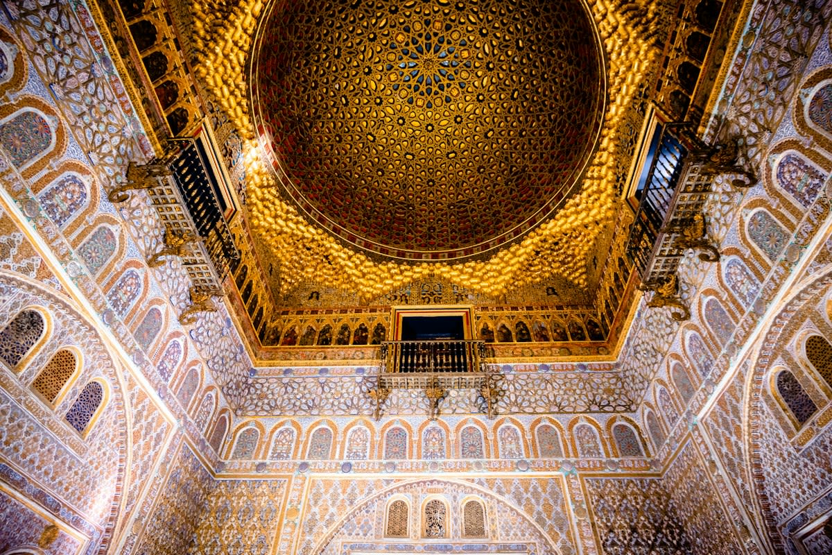
However, the march toward minimalism is not universal. In the Cotai strip of Macau, some luxury entities are doubling down on dramatic, rich environments. The 13 Palace explicitly rejects the minimalist trend that has consumed most modern hotels (Source: IAG, 2026). They argue that because most people live and work in minimalist, ash-streaked environments day-to-day, they crave the opposite during special occasions. For these guests, luxury is not found in the void, but in the abundance of irreplicable carvings and craftsmanship.
The 13 Palace strategy is based on the idea of the lifestyle experience as a deviation from the norm. While the rest of the world moves toward a calcified version of simplicity, this institution preserves opulent design to offer a different reality (Source: IAG, 2026). They use a restrained approach only in the sense of renovation, ensuring that original architecture is not destroyed by the urge to follow current trends. This creates a sharp divide in the luxury market: minimalism for daily authenticity, and maximalism for escapist fantasy.
The technical justification for the minimalist side of this divide lies in the principles of graphic design. White space, or negative space, is not merely an empty area but a functional tool used to guide the eye and create movement (Source: SWOSU LibGuides). By managing the proximity of objects and using hierarchy, designers can force the viewer to focus on a single, specific element. When a brand uses a massive amount of negative space, they are telling the consumer that the remaining element is so valuable it requires its own atmosphere to exist.
This strategic use of space allows elements to breathe and shine without competing with surrounding noise (Source: Instagram). Alignment and repetition further reinforce this sense of order, making the product feel engineered rather than assembled. In the hands of a skilled designer, negative space becomes a psychological anchor. It suggests a level of confidence that the product does not need to scream for attention, which ironically attracts more attention than any gold-leafed label ever could.
The Failure Point: The Paper Bottle Mirage
The pursuit of minimalism often collides with the reality of consumer behavior. A primary example is the push for mainstream availability of paper bottles, spearheaded by brands like Johnnie Walker, Absolut Vodka, and Greenall’s Gin (Source: The Spirits Business, 2026). While the concept aligned with the minimalist and sustainable ethos, it failed to gain significant mainstream traction. The tactile experience of paper did not communicate the same level of luxury as lightweight glass, proving that there is a floor to how much you can strip away before the product feels cheap.
This failure illustrates the thin line between restrained premiumisation and perceived devaluation. When the material choice removes too much of the traditional luxury signifiers, the consumer stops seeing minimalism and starts seeing a lack of investment. The industry has learned that you can sell air, but you still need a vessel that feels like it belongs in a high-end environment. The paper bottle experiment was a step too far into the void, resulting in a product that lacked the necessary prestige to justify its price.
Editorial Note
The industry's obsession with minimalism is often a cover for cost-cutting. Reducing glass weight and stripping ornamentation lowers production costs, while the 'minimalist' branding allows the company to maintain or even increase the retail price under the guise of 'sophistication'.
Fact-Check & Accuracy Note
All data regarding spirits packaging trends and the failure of paper bottles is attributed to The Spirits Business, 2026. Hotel design data is sourced from IAG, 2026. Design principles are sourced from SWOSU LibGuides.