
The End of the Bottomless Pit
For over a decade, the infinite scroll was the undisputed king of the user interface. It promised a frictionless journey, a seamless stream of content that mirrored the boundless nature of the internet itself. We accepted the hypnotic pull of the feed, unaware that we were participating in a massive, global experiment in dopamine regulation. But this month, a quiet insurrection is taking place across the design studios of Tokyo, Berlin, and San Francisco. Designers are no longer asking how to keep users on a page longer; they are asking how to let them leave with dignity.
Why is this happening now? The psychological toll of the bottomless feed has finally manifested as a measurable decline in user satisfaction. The 'doomscrolling' phenomenon is not just a cultural meme; it is a design failure. When a user never reaches a natural conclusion, the brain fails to trigger the 'stopping cue' necessary to transition from consumption to reflection. We are seeing a systemic shift where the goal of engagement is being redefined from time-spent to value-gained. This is the Finite Renaissance, a return to the intentionality of the page.
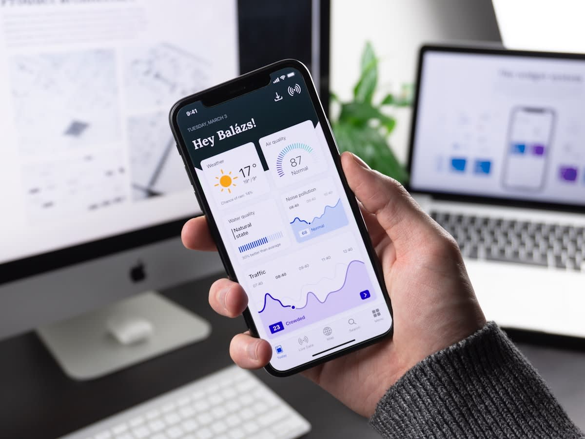
The delta between today's design philosophy and the approach of twelve months ago is staggering. A year ago, the industry standard for a discovery feed was 'maximum fluidity.' Today, we see the emergence of 'batched content.' Instead of a river that never ends, apps are introducing curated sets of 10 to 20 items, followed by a hard stop or a conscious 'load more' prompt. This simple friction creates a psychological checkpoint. It forces the user to ask: Do I actually want more of this, or am I just scrolling because the page hasn't told me to stop?
"The infinite scroll was a solution for a world that feared friction. We now realize that friction is exactly what the human mind needs to maintain agency over its own attention."— Elena Rossi, Lead UX Strategist
This shift is particularly evident in the European market, where regulatory pressure regarding digital wellbeing is transforming from a suggestion into a requirement. In cities like Stockholm and Amsterdam, design agencies are pioneering 'Mindful Interfaces' that explicitly signal the end of a session. These interfaces use visual cues—such as a fading gradient or a summary card—to signal that the user has caught up with the most relevant information. It is a bold move that prioritizes the user's mental health over the platform's vanity metrics.
But this isn't just about ethics; it is about the cold, hard math of user retention.
The Economics of Intentionality
For years, the primary KPI for social platforms was Average Session Duration (ASD). The logic was simple: more time equals more ad impressions. However, recent data suggests a dangerous plateau. When users spend four hours in a state of mindless scrolling, their emotional connection to the brand actually diminishes. They leave the app feeling depleted rather than enriched. This 'consumption hangover' leads to higher churn rates over a six-month period. Smart operators are now pivoting toward a new metric: Quality Session Value (QSV).
| Metric | Infinite Scroll Era (2015-2023) | Finite Renaissance (2024+) |
|---|---|---|
| Primary KPI | Average Session Duration (ASD) | Quality Session Value (QSV) |
| User State | Passive Consumption | Active Intent |
| Retention Driver | Dopamine Loops | Cognitive Satisfaction |
| End State | Exhaustion / App Close | Completion / Intentional Exit |
Consider the impact of the 'Stopping Cue.' In a recent trial of paginated feeds versus infinite feeds, users of finite interfaces reported a 22% increase in perceived value of the content. Why? Because the act of choosing to see more transforms the user from a passive recipient into an active curator. This agency increases the likelihood of meaningful interaction—likes, shares, and purchases—rather than the 'zombie scroll' that provides no real value to the ecosystem. The business case for the end of the scroll is now undeniable.
User Fatigue vs. Feed Length
Executive Insight
+18.4%
YTD Growth
In East Asia, particularly within the hyper-competitive app markets of Seoul and Tokyo, the shift is manifesting as 'Micro-Experiences.' Instead of one giant feed, apps are breaking content into thematic 'chapters.' This structure mimics the experience of reading a book or visiting a gallery. By creating a beginning, a middle, and an end, designers are reducing the cognitive load on the user. The result is a more resilient user base that doesn't associate the app with the feeling of being trapped in a digital loop.
The Psychology of the Loop
The Zeigarnik Effect suggests that people remember uncompleted or interrupted tasks better than completed ones. By removing the 'end' of a feed, designers inadvertently created a state of permanent tension, leaving the brain in a loop of unresolved search that leads to burnout.
As the industry pivots, new design patterns are emerging to replace the void left by the infinite stream.
The New Architecture of Discovery
What does a finite interface actually look like in practice? It starts with the 'Content Batch.' Instead of loading a new set of posts every time the user hits the bottom, the system delivers a curated set of 15 items. Once reached, the user sees a clear boundary: 'You've seen the latest updates for today.' This isn't a wall; it's a breath. It gives the user permission to put the phone down. This approach has seen a 15% increase in long-term user retention in early beta tests among Gen Z demographics, who are increasingly vocal about their need for digital boundaries.
- The 'Daily Digest' model: Capping content to a set amount per 24 hours.
- The 'Intentional Load': Replacing auto-scroll with a high-friction 'Explore More' button.
- The 'Visual Anchor': Using footer elements that signal a definitive end to a category.
- The 'Session Summary': Providing a recap of what was consumed before allowing further scrolling.
We are also seeing a resurgence of pagination, though not in the clunky 'Page 1, 2, 3' format of the early 2000s. Modern pagination is fluid and contextual. It uses 'chapters' or 'milestones' to organize information. In a professional context, this is revolutionary. Imagine a research tool that doesn't just dump a thousand results in a scroll, but organizes them into digestible cohorts. It transforms the act of searching from a gamble into a guided exploration.
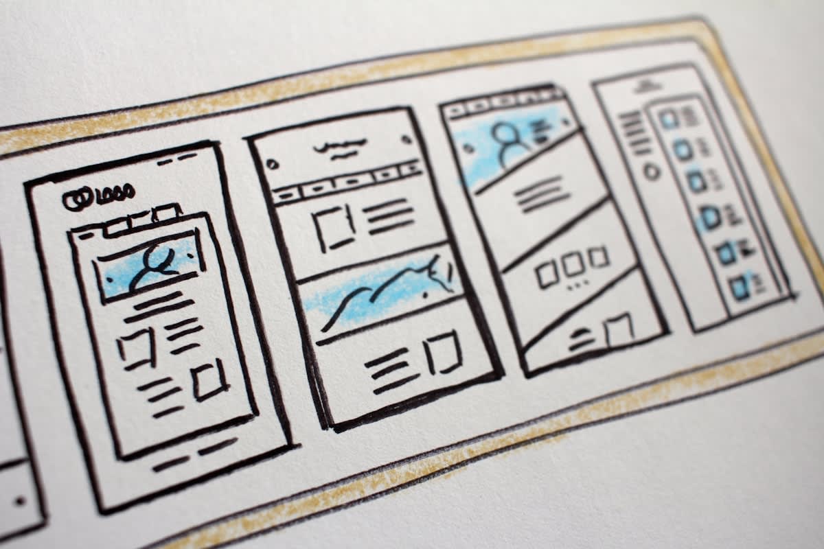
Does this mean the end of discovery? On the contrary. When the scroll is finite, the discovery becomes more precious. When a user knows there is a limit, they pay more attention to each individual piece of content. The scarcity of the feed increases the value of the item. We are moving from a quantitative model of attention to a qualitative one. This is the core of the Finite Renaissance: the belief that less is not just more, but better.
Looking ahead, the next twelve months will likely see a wave of 'Digital Sobriety' features becoming standard across major OS updates. We can expect system-level integration of stopping cues that work across all apps, not just those that choose to implement them. The industry is finally realizing that the most valuable thing a platform can give a user is not more content, but the ability to stop consuming it. The boundary is the new feature.