
Stop thinking about beauty. If you're designing for 'pretty,' you're designing for the middle class. I've spent two decades in the trenches of luxury houses from Milan to the back-alleys of Tokyo's Aoyama district, and I've seen the same mistake a thousand times. Beginners think luxury is about aspiration—about looking like a dream. It isn't. True high-end luxury is about exclusion. When the mass market finally figures out what 'elegant' looks like, the elite move the goalposts. They don't move them to 'more elegant.' They move them to something repulsive.
It's called counter-signaling. When a signal (like a gold watch or a clean silhouette) becomes too common, it loses its value. It becomes a 'loud' signal of someone trying too hard to look rich. To separate themselves, the truly powerful adopt a signal that looks like a mistake to the uninitiated. A neon-slime green handbag. A muddy, bile-colored trench coat. A shoe that looks like it was found in a dumpster in New Jersey. If you can wear something objectively hideous and still be treated with deference, you've signaled that your status is so secure you no longer need to follow the rules of aesthetics.
The Prerequisites for Visual Repulsion
You can't just wake up and decide to be ugly. Do that with a startup brand and you'll just be a brand that makes ugly clothes. There is a specific set of systemic requirements you need before you can weaponize bad taste. I've seen countless creative directors try to force this pivot in the boardroom, only to be laughed out of the room because they lacked the necessary leverage. You aren't selling a color; you're selling the permission to be hated.
- Immense Brand Equity: You need a century of 'pretty' in the archives so the 'ugly' feels like a deliberate choice, not a lack of skill.
- A High-Net-Worth Echo Chamber: A client base in hubs like Seoul's Gangnam District or Dubai's DIFC who value peer-recognition over general public approval.
- Price Inaccessibility: The item must cost more than a mid-sized sedan. The price tag transforms 'ugly' into 'avant-garde.'
- Cultural Capital: The ability to frame the repulsion as a critique of bourgeois taste.

The Execution: How to Pivot to the Abject
The process isn't an accident. It's a calculated demolition of taste. I've watched this happen in real-time during seasonal pivots. It starts with a subtle shift—a slightly 'off' beige—and escalates until you're looking at colors that look like industrial runoff. The goal is to create a visual barrier. If a garment is visually offensive, the average person won't buy it, even if they can afford it. This ensures the 'club' remains small.
- Identify the 'Safe' Consensus: Map out the current 'quiet luxury' palette—creams, navys, charcoals. This is the territory you must abandon.
- Locate the Aesthetic Void: Find colors that are traditionally avoided in luxury—chartreuse, mustard-brown, muddy mauve. These are your new weapons.
- Apply the 'Costly Signal' Pricing: Price the item 30-50% higher than your traditional 'pretty' pieces. This forces the buyer to make a conscious decision to spend more for something less traditionally appealing (Source: Journal of Consumer Research, 2019).
- Seed to the Outliers: Don't give the pieces to the mainstream influencers. Give them to the 'weird' elite—the architects in Tokyo, the gallery owners in Berlin, the tech-heirs in San Francisco.
- Wait for the Fast-Fashion Decay: Wait for Zara or H&M to copy the color. The moment the mass market adopts the 'ugly' color, the elite will abandon it. The cycle is complete.
"The most powerful form of status is not the ability to acquire the best, but the ability to define what is best, even when it contradicts every established rule of beauty."— Thorstein Veblen, Sociologist and Author of The Theory of the Leisure Class
This is a game of chicken played with the consumer's ego. The brand asks: 'Are you confident enough in your status to wear this monstrosity?' The consumer answers by buying it, effectively saying: 'I am so rich that I don't need your approval of my taste.' It's a feedback loop of arrogance and capital.
Ground-Level Friction: The Atelier War
Here is what the textbooks don't tell you: this process is a nightmare inside the company. I remember a project in Paris where the Creative Director insisted on a shade of yellow that looked like nicotine-stained fingers. The production team hated it. The sales leads were screaming that they'd never move the inventory. There were literal shouting matches in the sample room. The CFO wanted 'commercial' colors—black, white, tan—because those have a higher sell-through rate (Source: Bain & Company, 2023). But the Creative Director knew that 'commercial' is the death of luxury. He pushed through, the item sold out in four hours to a handful of collectors in Shanghai and Riyadh, and the CFO shut up. That is how the industry actually works: ego trumping data until the data proves the ego right.
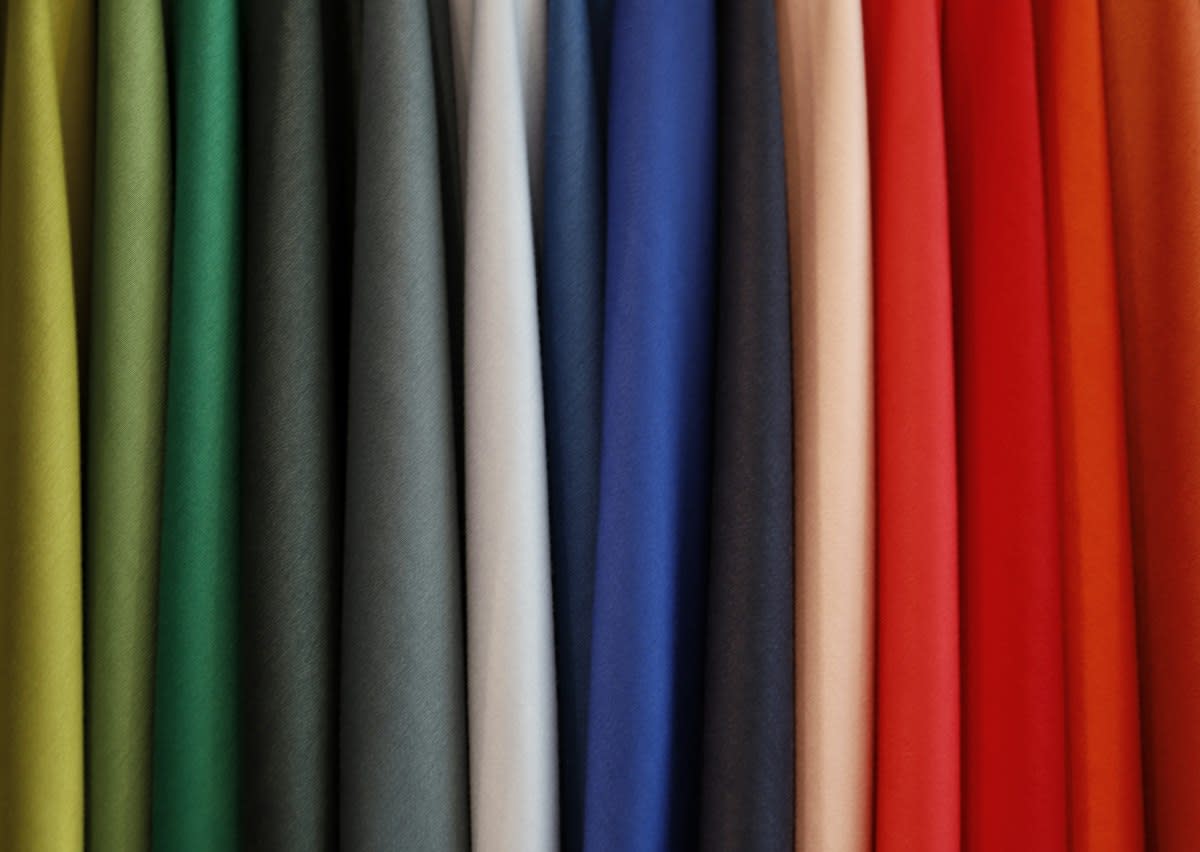
The friction doesn't stop at the boardroom. You have to deal with the hardware. Dyeing high-end silks or leathers in these specific, 'ugly' tones is often a technical disaster. You'll have batches that come out looking like bruised fruit instead of the intended 'muted plum.' You'll waste thousands of yards of fabric because the color doesn't 'read' right under the harsh lights of a boutique in Ginza. It's a messy, expensive process of trial and error that most people mistake for a seamless 'creative vision.'
| Signal Type | Visual Cue | Target Audience | Psychological Driver |
|---|---|---|---|
| Aspirational | Classic Beauty/Gold | New Money / Middle Class | Desire for acceptance |
| Counter-Signal | Intentional Ugliness/Neon | Old Money / Ultra-High-Net-Worth | Desire for distinction |
| Quiet Luxury | Neutral/No Logos | The 'Stealth' Elite | In-group recognition |
Common Pitfalls for the Uninitiated
Most brands fail at this because they mistake 'ugly' for 'weird.' There is a difference. 'Weird' is just quirky; it's accessible. 'Ugly' in a luxury context must be confrontational. If you make something that is just 'a bit strange,' you're not counter-signaling; you're just failing at design. You have to lean into the repulsion. If the sales team isn't terrified of the product, you haven't gone far enough.
- The 'Too Much' Trap: Adding too many ugly elements makes the piece look like a costume. Pick one 'offensive' element—the color—and keep the craftsmanship impeccable.
- The Logo Crutch: Relying on a giant logo to sell an ugly color. If you need the logo to make the color acceptable, you've failed the counter-signaling test. The color itself should be the signal.
- Timing the Market: Launching the 'ugly' phase too early. If you do it before you've established a 'pretty' baseline, you're just a niche brand with bad taste.
I've seen brands try to pivot to this 'ugly-chic' aesthetic and end up alienating their core base without attracting the ultra-elite. They end up in a no-man's land of taste. They aren't pretty enough for the aspirational crowd and they aren't daring enough for the counter-signalers. It's a fast track to bankruptcy.
Fact-Check & Accuracy Note
The current debate in the industry centers on whether 'ugly' has become its own new 'pretty.' As Gen Z adopts the 'ironic' aesthetic, the ultra-elite are beginning to move back toward extreme minimalism. The cycle is accelerating. What was 'ugly' in 2020 is 'basic' in 2024.