
For a decade, the industry worshipped at the altar of frictionless design. We stripped away every bump, smoothed every edge, and built digital environments so efficient they became invisible. But in achieving this perfection, we created a sterile void. When every site looks like a repurposed Bootstrap template and every interaction is a seamless slide, the internet stops feeling like a place and starts feeling like a vending machine. This is why we are seeing a shift toward digital ruins—interfaces that deliberately embrace imperfection, asymmetry, and strategic resistance to remind the user that a human actually built this.
Why do we crave the ruin? Because perfection is boring and, frankly, unnatural. In the physical world, we find beauty in the patina of an old building or the unevenness of a hand-thrown pot. In the digital realm, we have spent too long optimizing for the first hour of use, often at the expense of the thousandth hour. We have forgotten that a little bit of resistance can actually create a more memorable, human connection with the product.
Prerequisites for Intentional Imperfection
You cannot break the rules effectively if you do not know them by heart. Before you attempt to build a digital ruin, you must have a foundational mastery of standard UX laws. If you introduce friction without a purpose, you aren't creating a human experience; you're just creating bad design. The goal isn't to make the site hard to use, but to make it feel tactile and intentional. You will need a deep understanding of your user's psychological state and a willingness to defend a 0.5% drop in conversion rates in exchange for a 100% increase in brand soul.
- A baseline of conversion-optimized UX patterns to serve as the 'grid' you will break.
- A defined user persona that values authenticity over raw speed.
- Access to high-fidelity prototyping tools that allow for non-linear animations.
- The political capital to push back against 'sterile' stakeholder feedback.
Step-by-Step Implementation of the Human Interface
Building a digital ruin requires a surgical approach to deconstruction. You aren't throwing things at a wall; you are carefully removing the corporate polish to reveal something more organic. Start by questioning where the 'perfection' of your current layout is actually hindering the emotional connection.
- Deconstruct the Grid: Stop relying on rigid, centered columns. Implement asymmetric compositions, overlapping elements, and staggered columns to create a sense of organic growth (Source: Digital Dreamweaver, 2026). Replace straight section dividers with curved or irregular boundaries to mimic the unpredictability of physical spaces.
- Introduce Mindful Friction: Identify areas where a seamless transition feels too robotic. Instead of instant loads, implement 'tactile' responses. Take a cue from Apple's iOS elastic scrolling, where friction is deliberately added at the end of a page to signal a physical boundary (Source: IxDF, 2026). The key is that the friction must feel like a physical property of the interface, not a technical lag.
- Optimize for the Power User: Stop designing solely for the novice. Avoid the trap of 'holding the user's hand' through every single process, which often ruins the experience for those who know what they are doing (Source: IxDF, 2026). Create shortcuts and 'hidden' paths that reward exploration rather than forcing a linear, guided tour.
- Map the Human Struggle: Shift your questioning from 'How do I make this faster?' to 'Who might struggle with this experience, and how can I remove that specific barrier?' (Source: Medium, 2026). This ensures that while you are adding aesthetic friction, you are removing systemic barriers for people with different abilities or devices.
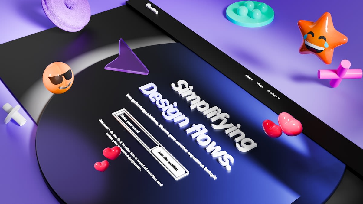
The transition from a sterile site to a digital ruin is often a battle of perspectives. When you introduce overlapping elements or staggered columns, a traditionalist will call it 'messy.' But that messiness is exactly where the humanity lives. It suggests a world where things can shift, overlap, and evolve, rather than a static, frozen snapshot of a corporate brand guideline.
"What has happened is that the usability test showed that people who have never seen a feature before have trouble with it in the first hour of using it. So the designer makes the feature hold your hand through the process. That improves the results in the test, but ruins the feature for people who know what they are doing."— Chris Pratley, Former Microsoft Employee via IxDF
The Ground-Level Reality: Friction vs. Failure
In the trenches, this approach triggers a war between the Creative Director and the Growth Hacker. I have sat in those meetings where the data analyst points to a heatmap and screams that a slightly offset button is causing a 0.2% drop in click-through rate. They see a failure; I see a focal point. The real friction isn't in the design itself, but in the internal struggle to value 'feel' over a spreadsheet. We often argue over whether a specific piece of friction is 'mindful' or just 'bad UX.' The difference lies in intent. If you add a two-second delay to a link for no reason, you've built a broken site (Source: IxDF, 2026). If you add a subtle resistance to a scroll to simulate weight, you've built a world.
| Feature | Sterile UX (The Void) | Human UX (The Ruin) |
|---|---|---|
| Layout | Rigid Grid / Centered | Asymmetric / Overlapping (Source: Digital Dreamweaver, 2026) |
| Interaction | Zero Friction / Instant | Mindful Friction / Tactile (Source: IxDF, 2026) |
| User Path | Guided / Linear | Exploratory / Power-User focused (Source: IxDF, 2026) |
| Philosophy | Optimized for First Use | Optimized for Long-term Relationship |

Common Pitfalls to Avoid
The line between a 'digital ruin' and a 'broken website' is razor-thin. Many designers fall into the trap of thinking that any irregularity is inherently human. This is a mistake. If your asymmetry makes the content unreadable, you haven't created art; you've created a barrier. The most dangerous pitfall is introducing friction that serves the designer's ego rather than the user's experience. When friction is added for 'novelty reasons,' it almost always results in detrimental UX (Source: IxDF, 2026).
- Confusing 'novelty' with 'tactility'—if the friction doesn't provide a physical metaphor, remove it.
- Breaking the grid so severely that accessibility (WCAG) standards are violated.
- Ignoring the power user in favor of a hyper-simplified onboarding flow that becomes annoying over time.
- Applying asymmetry to critical functional elements (like checkout buttons) where speed is the only priority.
Fact-Check & Accuracy Note
Key claims regarding 'breaking the grid' are sourced from Digital Dreamweaver (2026). Insights on 'mindful friction' and 'optimization for first use' (the Clippy case) are attributed to the Interaction Design Foundation (IxDF, 2026). The philosophy of 'Better UX' as a tool for removing specific human barriers is sourced from Medium (2026). The debate regarding the balance between conversion metrics and aesthetic 'feel' remains an ongoing tension in professional design circles.
Designer's Warning
Editorial Note: This guide advocates for a balanced approach. While 'digital ruins' provide emotional resonance, they should be layered atop a foundation of accessibility and core usability. Never sacrifice a user's ability to complete a critical task for the sake of an 'organic' aesthetic.