Prerequisites for Industrial Execution
Building a high-trust interface requires a departure from the soft shadows and rounded corners of contemporary SaaS design. To execute this style, you need a stack that supports rigid constraints and high-contrast styling. A modern frontend framework like Next.js or Vue 3 is essential, paired with a utility-first CSS engine. Tailwind CSS is the industry standard here, as it allows for the precise control of borders and spacing required to mimic industrial materiality. You will also need access to a component primitive library, such as shadcn-ui, to serve as the skeletal structure before applying the brutalist skin.
- Install Tailwind CSS for granular control over spacing and border-width.
- Integrate a primitive component library (e.g., shadcn-ui or Radix UI) to ensure accessibility remains intact.
- Configure a high-contrast color palette: pure blacks (#000000), stark whites (#FFFFFF), and one saturated accent color.
- Define a rigid grid system based on 4px or 8px increments to maintain structural tension.
Establishing Visual Tension and Structural Honesty
Trust in a digital interface is often eroded by hidden logic and obscured hierarchies. Industrial Brutalism solves this by embracing functionality in its rawest form. According to design taxonomies, this style is defined by a minimal approach that rejects ornamentation in favor of utility. When a user sees a hard-edged border and a stark layout, the interface is signaling that it has nothing to hide. Why do we trust a concrete wall more than a drywall partition? Because the material is the structure. In UI, this means the border is not just a decoration; it is the boundary of the data.
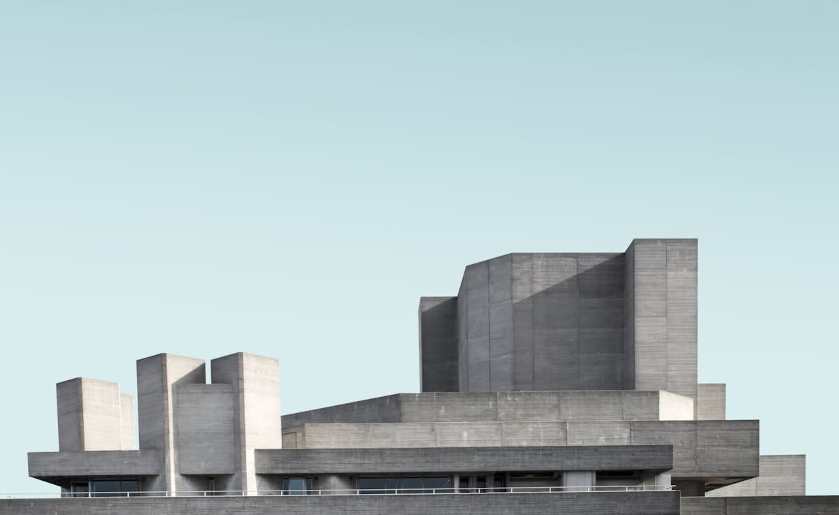
To recreate this in a browser, you must introduce visual tension. This is achieved by using thick, non-anti-aliased borders and avoiding the common tendency to soften edges. MengTo identifies the industrial-brutalist direction as one that utilizes strong structure to create a sense of permanence. By removing the 'air' and 'glow' associated with modern web design, you force the user to focus on the information architecture. This clinical precision removes the emotional manipulation found in 'friendly' UIs, replacing it with a professional, resilient reliability.
The Materiality Principle
The psychological link between raw materials and trust lies in predictability. When an interface looks like a tool—rather than a marketing brochure—the user subconsciously assigns it a higher degree of operational reliability.
Deploying Neobrutalist Component Logic
Neobrutalism evolves the raw industrial look into a modern web context by adding bold colors and exaggerated shadows. This approach is currently being democratized through open-source libraries. GitHub repositories for neobrutalism reveal a surge in Tailwind-based components for React, Next.js, and Svelte. These libraries move away from the 'glassmorphism' trend, instead opting for high-contrast offsets. By using a hard black shadow (e.g., 4px 4px 0px #000), you create a tactile sense of depth that feels like physical layering rather than a digital blur.
/ Tailwind Config for Industrial Materiality /
module.exports = {
  theme: {
    extend: {
      colors: {
        'industrial-gray': '#C0C0C0',
        'concrete-dark': '#333333',
        'accent-yellow': '#FFFF00',
      },
      boxShadow: {
        'brutal': '4px 4px 0px 0px rgba(0,0,0,1)',
        'brutal-lg': '8px 8px 0px 0px rgba(0,0,0,1)',
      },
      borderWidth: {
        '3': '3px',
      }
    }
  }
}
The diversity of these tools—spanning Angular (via Ng Brutalism), Vue, and Svelte—indicates a broader movement toward this aesthetic. This is not merely a visual trend but a reaction against the homogenization of the web. When every site uses the same rounded-corner, pastel-colored design system, users become blind to the actual utility of the product. Neobrutalism breaks this blindness. It uses raw, beautiful, and bold elements to signal a specific type of authority: the authority of the engineer over the authority of the marketer.
| Element | Standard Modern UI | Industrial Brutalist UI |
|---|---|---|
| Borders | 1px, light gray, rounded | 3px+, pure black, sharp |
| Shadows | Soft, blurred, Gaussian | Hard, offset, 0px blur |
| Typography | Sans-serif, medium weight | Monospace or Heavy Grotesque |
| Color Palette | Pastels, gradients, whites | Primary colors, stark contrast |
Transitioning from component selection to overall composition requires a strict adherence to the grid. In an industrial context, the grid is the law.
The Engineering of Trust
How do we translate the feeling of Eastern European industrialism—concrete, steel, and raw utility—into a digital experience? It begins with the rejection of 'frictionless' design. Frictionless design often feels deceptive because it hides the effort and the process. Industrial materiality, conversely, makes the process visible. By using mono-spaced fonts and exposed grid lines, you are showing the user the scaffolding of the application. This transparency is the root of trust.
"The brutalist design style is a raw, minimal style of design that embraces functionality."— Laher Design
Consider the industrial standards of the mid-20th century, where objects were designed for durability and mass production. The clothing industry, for instance, shifted toward standardized mass production during the Civil War to meet urgent needs, prioritizing a ledger of industrial convenience over bespoke tailoring. A similar shift is happening in UI. We are moving away from 'bespoke' pixel-perfect animations and returning to a standardized, industrial utility. This shift is a resilience strategy; it ensures that the interface remains legible and functional regardless of the device or the user's cognitive load.

This aesthetic is particularly effective for data-heavy applications, fintech dashboards, and developer tools. In these contexts, the user is not looking for an emotional experience; they are looking for a reliable tool. By stripping away the decorative layers, you reduce the cognitive distance between the user and the data. The interface becomes a transparent window, not a curated gallery. This is the ultimate expression of high-trust design: the interface that disappears because it is so obviously functional.
Common Pitfalls in Industrial Deployment
- Softening the edges: Adding a 4px border-radius to a brutalist component destroys the industrial tension.
- Over-decorating: Using too many bold colors turns a professional tool into a comic book. Stick to one primary accent.
- Ignoring Accessibility: High contrast is good, but ensure your color combinations pass WCAG AA standards to avoid alienating users.
- Inconsistent Grids: A single misaligned element in a rigid grid is more noticeable than in a fluid layout, creating a sense of sloppiness rather than rawness.
Executing this style requires a level of discipline that modern design tools often discourage. You must resist the urge to 'polish' the interface. The goal is not to make the interface look old, but to make it look honest. When you embrace the raw, the minimal, and the functional, you stop designing for a target persona and start designing for a human being who needs a tool that works. This is where true digital trust is built: in the space between the raw material and the executed function.