
Why are we still obsessed with the frictionless experience? For years, the industry treated every millisecond of lag as a failure. We scrubbed every interaction until it was a sterile, slippery slope toward a checkout button. But this pursuit of total fluidity has a cost. It creates a hollow connection. When a user glides through a process without a single point of resistance, they forget they are even using the product. They are not engaged; they are merely drifting. The real premium value now lies in the intentional tether—the moment where we force a user to slow down, think, and actually feel the weight of their decision.
Prerequisites: Understanding the Resistance Spectrum
Before you inject resistance into a product, you must distinguish between mechanical failure and intentional asymmetry. Not all lag is created equal. Bad resistance is a bug; good resistance is a feature. In the realm of Human-Computer Interaction (HCI), challenging design elements—those that are intentionally difficult or inefficient—can actually increase user engagement (Source: arXiv, 2026). The goal is to move away from the intuitive default and toward a state of meaningful challenge. If the user is a novice, intuitive design prevents them from feeling overwhelmed. But for the power user, the intuitive path is a bore. They want the climb.
Editorial Note
This guide focuses on the transition from 'seamless' to 'significant'. We are not discussing the removal of bugs, but the strategic addition of cognitive load to create a sense of ownership and value.
Step 1: Identify the Engagement Gap
Look for the areas where users are operating on autopilot. Where is the interaction too fast? When a user completes a high-stakes action in a fraction of a second, the perceived value of that action drops. This is the inertia of the seamless. To fix this, identify the 'magic box' fallacy. Many users expect AI-driven tools to be a magic box that solves everything instantly, but this expectation creates a collision between reality and anticipation (Source: Finding Our Way, 2026). When the result is too instant, the user distrusts the output or fails to value the effort behind it.

Consider the global shift toward 'slow' technology. In the kitchen appliance market, masticating juicers—which use a slower, crushing motion rather than high-speed blades—are seeing a surge in demand. The global juicer market was valued at approximately USD 2.8 billion in 2024 (Source: Grand View Research, 2024). Specifically, these slow-process machines are projected to grow at a compound annual growth rate (CAGR) of 8% through 2030, with the Asia-Pacific region leading the charge at a 12.9% CAGR through 2035 (Source: Market Research Future, 2035). Users are paying a premium for the lag because the slow process implies higher quality and better nutrient preservation. The resistance is the proof of value.
Step 2: Inject Intentional Asymmetry
Once you have identified the gap, stop optimizing for speed. Introduce a tether. This could be a manual confirmation step for a critical action or a visual representation of the 'work' being done by an agent. Instead of a loading spinner, show the steps of the logic. This transforms a void of waiting into a period of observation. By breaking the flow, you force the user to re-engage with the interface. You are moving from a default state of passive consumption to one of active participation.
"I think it’s very easy for us to get very fixated on what exists today, but this whole AI UX, agentic UX, everything that we’re working with right now is evolving so fast that the truth or the source of truth is evolving along with it."— Emily Campbell, Design Leader
This evolution requires us to be intentional about the moving target of user expectations. If the interface is too fluid, the user loses the tether to the process. The goal is to create a collision between the user's desire for speed and the product's requirement for precision. This is where the premium feel is born. It is the difference between a plastic button and a heavy mechanical switch. One is a trigger; the other is an event.
Step 3: Calibrate the Tension
Tension must be balanced. Too much resistance becomes a leak in the user experience, leading to frustration and abandonment. Too little, and you are back to the sterile default. Use UX laws to determine where the interface creates unnecessary friction versus where it creates meaningful resistance (Source: Orbix Studio, 2026). The key is to align the resistance with the value of the outcome. A high-value transaction should feel heavier than a low-value one.
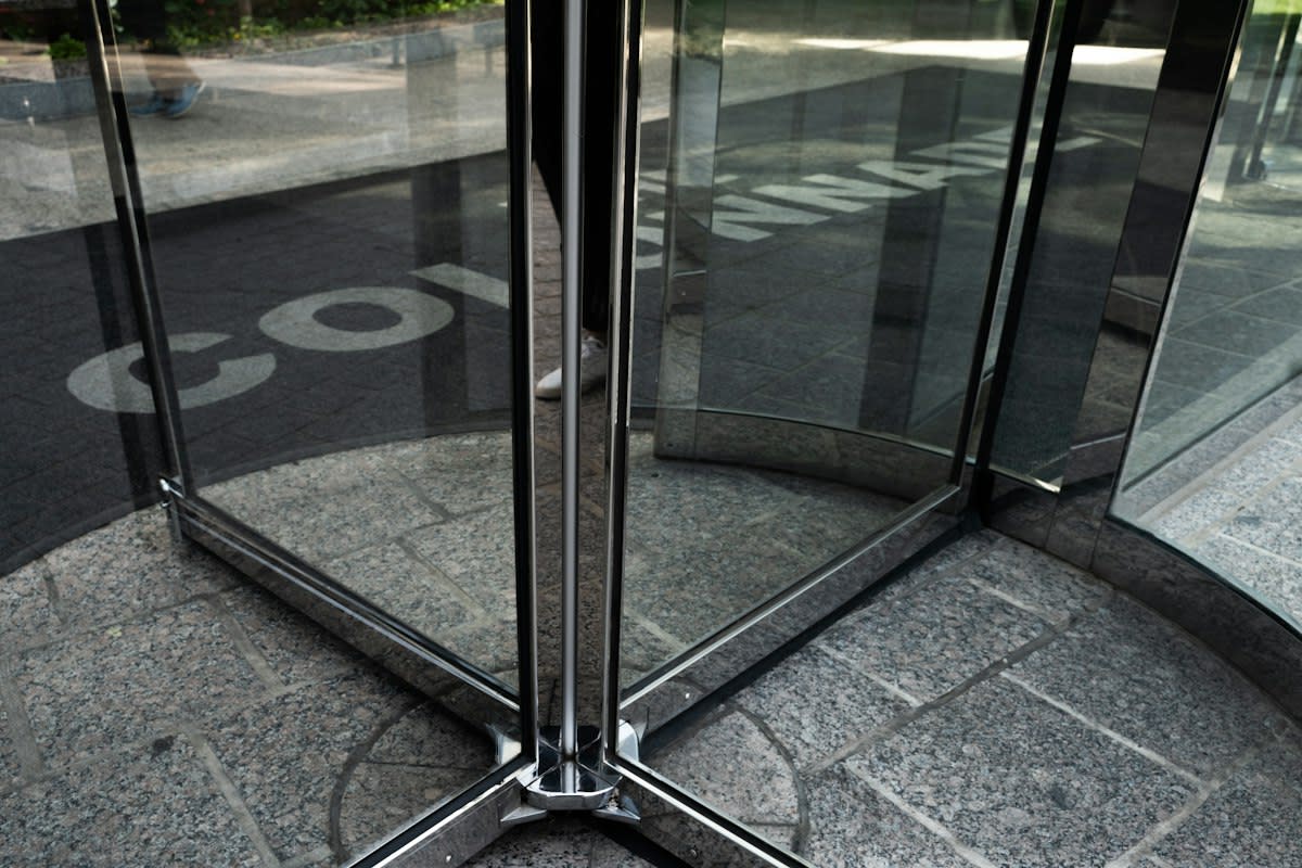
Take a lesson from physical architecture. Boon Edam’s frameless Crystal Tourniket uses glass for structural strength, but this creates a physical cap on the diameter at three meters because an unsuspended glass ceiling would sag (Source: MarketScale, 2026). To solve this, they don't just 'make the glass stronger'; they provide an adjacent accessible entrance. They acknowledge the mechanical failure and design around it. In digital design, we must acknowledge the cognitive limits of the user. When the cognitive load becomes too heavy, provide a side-channel—a way to bypass the resistance without losing the premium feel.
Step 4: Audit for Dark Patterns
There is a thin line between meaningful resistance and malicious design. Dark design patterns use friction to harm the user—making it intentionally difficult to cancel a subscription or hide privacy settings (Source: arXiv, 2026). This is not premium design; it is a siphon of trust. To ensure your resistance is premium, ask: Does this lag benefit the user's understanding, or does it benefit the company's bottom line at the user's expense? If the resistance serves to protect the user or increase their engagement with the core value, it is a feature. If it traps them, it is a failure.
As a practitioner, I have seen this battle play out in countless war rooms. The growth hackers want to remove every single click to increase conversion rates. They see a two-second delay as a catastrophe. But the product designers know that when you remove all the friction, you remove the intentionality. We have argued over 'confirmation modals' for years. The growth team calls them 'conversion killers.' I call them 'cognitive anchors.' Without that anchor, the user doesn't feel the weight of the action, and the churn rate eventually spikes because the users never formed a meaningful bond with the product.
Common Pitfalls to Avoid
- Over-frictioning the onboarding: Never introduce resistance before the user understands the value proposition. For novices, intuitive design is the only way to prevent them from feeling overwhelmed (Source: arXiv, 2026).
- Confusing lag with latency: Intentional lag is a design choice; latency is a server error. If the user perceives the resistance as a technical failure rather than a design choice, you have failed.
- Ignoring the context of urgency: Resistance is premium in a luxury experience or a high-stakes tool. In an emergency app or a utility tool, resistance is a liability.
- Applying the same friction to all user tiers: Power users crave the climb; novices crave the glide. Implement tiered resistance based on user proficiency.
Fact-Check & Accuracy Note
Verifiable Data Points: The growth of slow-tech is evidenced by the 8% CAGR of masticating juicers (Source: Grand View Research, 2024) and the HCI research identifying that challenging elements increase engagement (Source: arXiv, 2026). The debate remains whether these patterns can be scaled across all digital interfaces without inducing user fatigue.