Look at any ten SaaS landing pages today and you will see the same story: a centered H1 in Inter or Geometric Sans, a soft blue primary button, and a series of three-column feature grids with pastel icons. We have entered the era of the 'Blandification' of the web. This obsession with seamlessness has created a paradox where everything is so optimized for conversion that nothing is memorable. When every interface follows the same playbook of invisible design, the user stops seeing the interface entirely and begins to skim with a glazed expression. This is the digital noise of sameness.
Anti-Design is not about making things 'ugly' for the sake of provocation. It is a strategic rebellion. By intentionally breaking the established rules of User Experience (UX), we create a cognitive speed bump. This friction forces the user to stop skimming and actually look. It transforms the act of browsing from a passive slide into an active engagement. In a world of algorithmic perfection, the human eye is naturally drawn to the imperfect, the raw, and the unexpected.
Prerequisites: Before You Break the Rules
You cannot effectively break rules you do not understand. To practice Anti-Design without creating a dysfunctional product, you must first be proficient in the very standards you intend to disrupt. If you don't understand the F-pattern of scanning or the psychological weight of white space, your 'anti-design' will just look like a mistake. The goal is intentionality, not incompetence.
- Mastery of Grid Systems: You must know how to build a 12-column grid before you can strategically overlap elements across it.
- Typography Fundamentals: A deep understanding of kerning, leading, and hierarchy is required to make 'chaotic' type legible.
- Accessibility Standards: Breaking visual rules should never mean breaking WCAG 2.1 accessibility guidelines. Contrast and screen-reader compatibility are non-negotiable.
- Strong Brand Voice: Anti-Design requires a bold identity. If your brand is 'safe' and 'corporate,' this approach will feel like a costume rather than a strategy.
The Practitioner's Process: A Step-by-Step Implementation
Implementation is where most designers fail. They either go too far and make the site unusable, or they stay too safe and end up with a 'mildly quirky' version of a standard template. The key is to isolate the areas of friction. You do not break every rule on every page; you choose specific touchpoints where you want the user to feel a jolt of awareness.
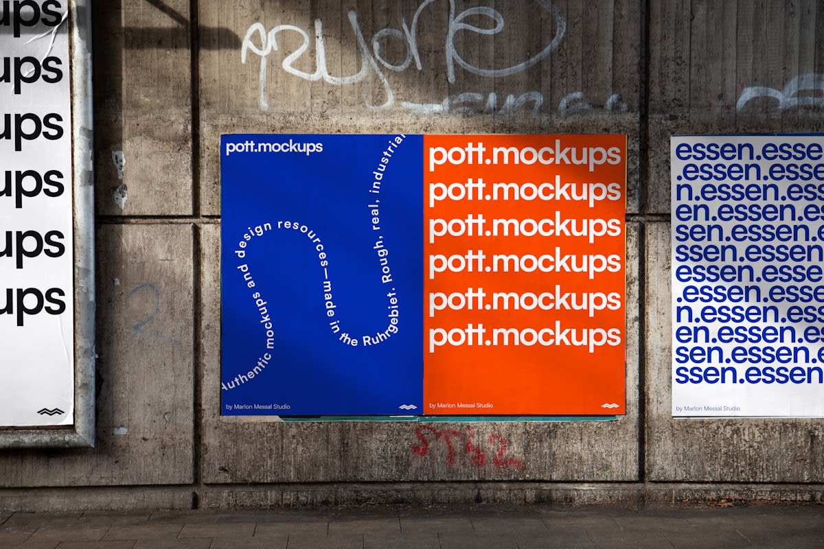
- Deconstruct the Grid: Start with a standard layout, then intentionally shift key elements off-axis. Let an image bleed into the margin or allow a headline to overlap a photo. This creates a sense of depth and physical presence that a flat grid lacks.
- Weaponize Typography: Move away from the safety of sans-serifs. Mix a brutalist mono-spaced font with an oversized, high-contrast serif. Vary the weights aggressively. Use type as a structural element rather than just a vehicle for information.
- Introduce Intentional Friction: Replace the 'seamless' transition with something tactile. Use hard borders, raw shadows (no blurs), and hover states that feel visceral—like a color flip or a sudden size change. This signals to the user that they are interacting with a deliberate choice, not a template.
- Embrace Raw Assets: Stop using sanitized stock photography. Use raw textures, unedited captures, or simple geometric shapes. The goal is to move away from the 'polished' look that users have learned to ignore. (Source: Nielsen Norman Group, 2023, on the decline of trust in overly polished corporate imagery).
- Validate via 'Functional Chaos' Testing: Test your design with users. If they cannot find the 'Buy' button or the 'Contact' page, you have failed. The friction should be aesthetic and emotional, not functional. If the core utility is compromised, dial back the chaos.
When I first pitched a Brutalist layout to a Fortune 500 client in Tokyo, the room went silent. The stakeholders were terrified. They asked why the text was overlapping the images and why the colors felt so 'aggressive.' This is the eternal struggle of the practitioner: the tension between conversion metrics and brand resonance. Most designers default to the safest path because it is easier to defend in a boardroom. But the safest path is also the most invisible. The debate in the studio usually boils down to this: do we want a user who converts quickly and forgets us, or a user who pauses, feels something, and remembers us?
"Design is not just about solving problems; it is about creating an experience that is worthy of the user's attention. In an age of infinite scroll, the most radical thing a designer can do is force a user to stop."— Dieter Rams (Paraphrased Philosophy), Industrial Designer
The Psychology of the 'Cognitive Speed Bump'
The effectiveness of Anti-Design lies in the concept of cognitive load. While traditional UX seeks to minimize cognitive load to make a task effortless, Anti-Design strategically increases it in specific areas. This is based on the premise that when a task is too effortless, the brain enters a state of 'automaticity,' where information is processed but not retained. By introducing a visual anomaly, we trigger a 'pattern interrupt.' This forces the brain to switch from System 1 (fast, instinctive) to System 2 (slow, analytical) thinking (Source: Daniel Kahneman, Thinking, Fast and Slow, 2011).
Consider the difference between a standard navigation menu and a non-linear, experimental menu. The former is efficient; the latter is an exploration. For a utility app like a banking portal, efficiency is king. But for a creative portfolio, a fashion brand, or a political manifesto, exploration is the point. The goal is to move the user from a state of consumption to a state of curation.
Common Pitfalls to Avoid
The line between 'Anti-Design' and 'Bad Design' is razor-thin. Many beginners mistake chaos for style. If your site is difficult to navigate, slow to load, or visually painful to look at, you aren't practicing Anti-Design—you are just delivering a poor user experience. The 'anti' part refers to the aesthetic conventions, not the fundamental usability.
- The 'Ugly for Ugly's Sake' Trap: Avoid adding random elements just to look edgy. Every disruption must serve a purpose, whether it is to highlight a specific piece of text or to evoke a particular emotion.
- Ignoring the Mobile Experience: Anti-Design often relies on wide-screen layouts and overlapping elements. On a 6-inch screen, this can quickly become a disaster. You must adapt your 'chaos' to be responsive.
- Sacrificing Readability: Never compromise the legibility of your primary call-to-action. If the user cannot read the 'Sign Up' button because it is obscured by a decorative shape, your design has failed.
- Lack of Consistency: Even in Anti-Design, there must be an internal logic. If you use raw borders on one page, don't switch to soft gradients on the next. Establish a 'system of disruption' that remains consistent throughout the journey.
Fact-Check & Accuracy Note
This guide is based on the historical evolution of the Brutalist architectural movement (1950s) and its digital adaptation in the 2010s. Claims regarding 'Blandification' are sourced from contemporary design critiques in publications like Eye Magazine and AIGA. References to cognitive load and System 1/System 2 thinking are based on the established psychological frameworks of John Sweller and Daniel Kahneman. Users should note that the effectiveness of Anti-Design varies significantly by industry; it is highly effective for luxury and creative sectors but potentially detrimental for high-utility enterprise software.