The new Instagram logo is the perfect embodiment of AI slop
Source Entity
Aurich Lawson
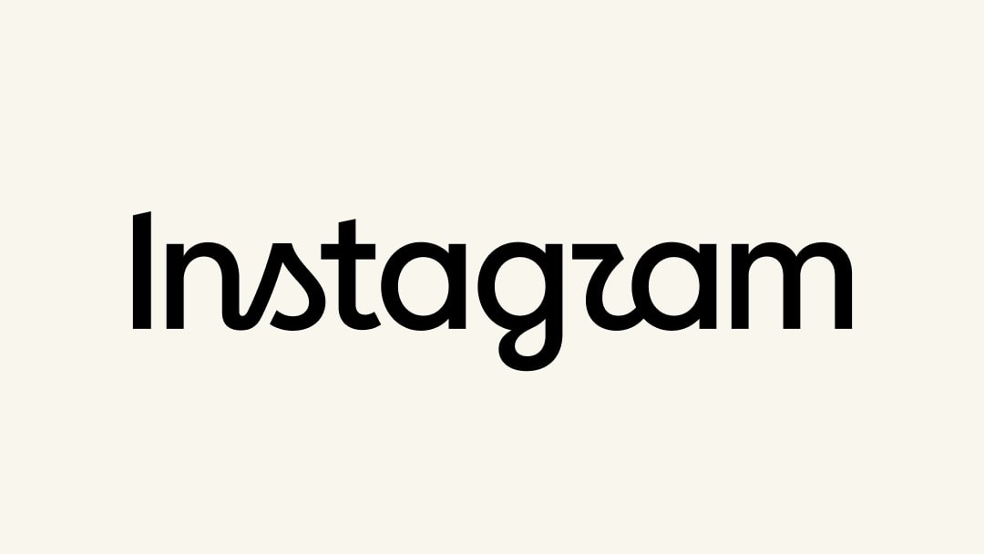
Instagram has officially unveiled a redesigned wordmark, replacing its decade-old cursive script with a more modern, hybrid typeface. While leadership describes the change as a necessary refresh, the update has sparked polarized reactions regarding its readability and aesthetic direction.
The Evolution of Instagram’s Visual Identity
Instagram has officially entered a new era of branding, moving away from the iconic cursive wordmark that has graced the top of the application for the past decade. This transition marks a significant shift for the platform, which has historically relied on its recognizable script to signify its identity in a crowded social media landscape. According to Instagram head Adam Mosseri, the decision to pivot was driven by a need for a "cleaner and more modern" aesthetic that pays homage to the platform's history while embracing contemporary design standards.
Analyzing the Design Shift
The new wordmark represents a departure from the fluid, handwritten aesthetic of the previous decade. By incorporating a hybrid style that blends print and cursive elements, the design seeks to modernize the brand. However, this change has not been without its critics. Early reception has been polarized, with some users and commentators questioning the legibility of the new font, humorously suggesting that the aesthetic shift makes the name appear more like "Instagzam" than the original branding.
Corporate Strategy and Public Reception
Adam Mosseri’s proactive approach to announcing the change—posting across both Instagram and its sister platform, Threads—indicates an awareness of the "controversial" nature of rebranding. By inviting "hot takes" from the community, Instagram is attempting to navigate the inherent tension that exists whenever a major tech giant alters a long-standing visual touchstone. While some users have praised the "fresher" look, others have labeled the move as an example of corporate "slop," arguing that the change lacks the character of the original.
The Broader Context of Tech Branding
In the fast-paced ecosystem of digital products, a ten-year lifespan for a logo is an eternity. This refresh reflects a broader industry trend where tech companies frequently iterate on their visual systems to maintain relevance. However, critics argue that such changes often serve as a distraction from deeper systemic issues, such as algorithmic influence and data practices. The juxtaposition of corporate "simplicity and craft" rhetoric against the reality of a data-driven platform highlights the divide between how these companies view their image and how users perceive their utility.
Implications for Future Trends
As Instagram continues to evolve, the discourse surrounding this wordmark serves as a case study in brand loyalty versus design evolution. Whether the new logo will eventually achieve the same cultural saturation as its predecessor remains to be seen. As the platform balances the need for a modern, "sharper" identity with the risk of alienating a user base accustomed to a decade of familiarity, the success of this redesign will likely be measured by how seamlessly it integrates into the daily user experience over the coming months.
Multiple Citing Sources