India Appears Smaller In World Map Than It Really Is. Here's Why
Source Entity
NDTV News Search Records Found 1000
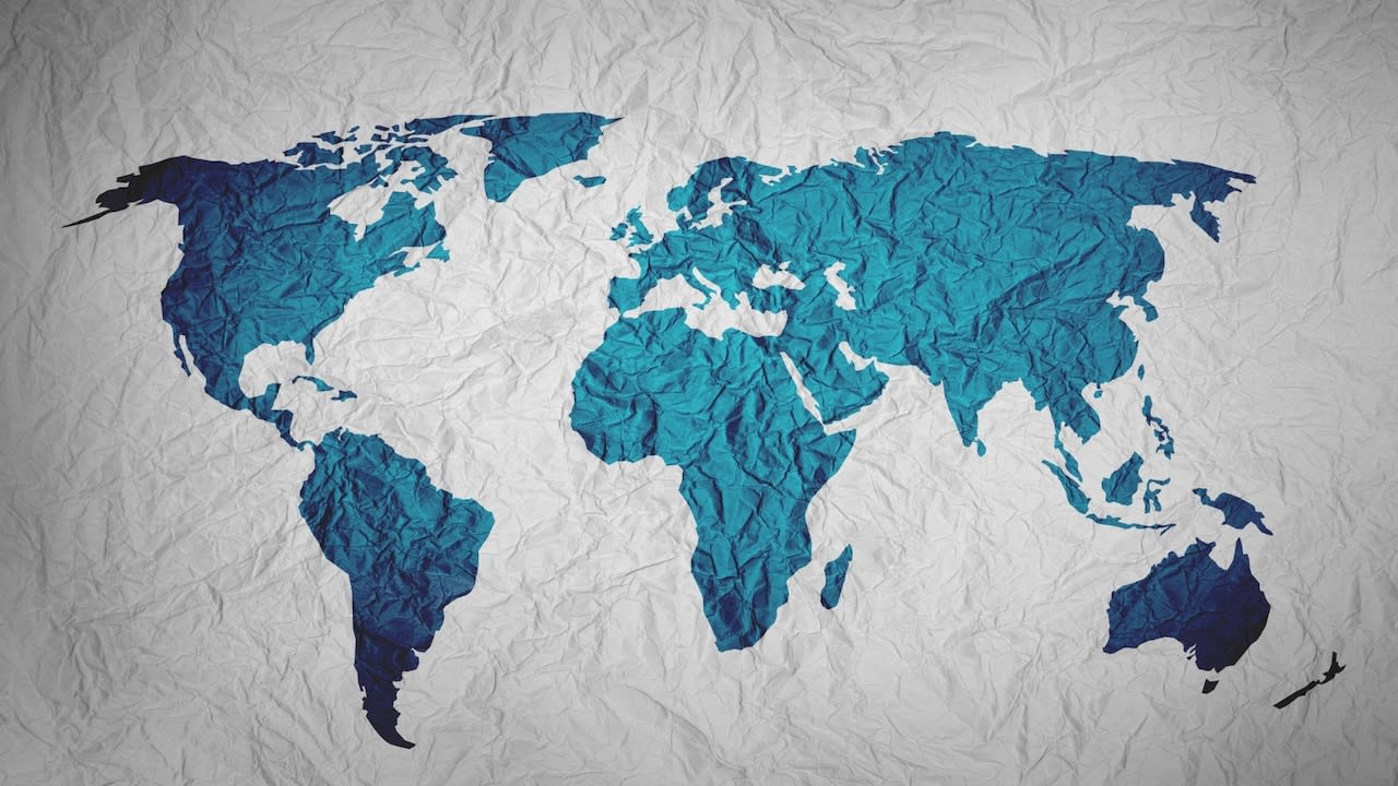
World maps often distort the perceived size of countries due to the mathematical impossibility of projecting a sphere onto a flat surface. This phenomenon, largely popularized by the Mercator projection, explains why India may appear smaller than it is relative to northern nations.
The Geometry of Distortion: Why Maps Deceive
The perception that India—or any other nation—appears smaller on a world map than it is in reality is a fundamental consequence of cartography. Because the Earth is a three-dimensional oblate spheroid, it is mathematically impossible to flatten its surface onto a two-dimensional map without introducing some form of distortion. Cartographers must choose which properties to preserve—such as area, shape, direction, or distance—knowing that prioritizing one inevitably compromises the others.
The Mercator Legacy
For centuries, the Mercator projection has been the standard for global navigation and classroom wall maps. Designed in 1569 for sailors, it preserves angles, which allows for straight-line navigation. However, this comes at a significant cost: extreme area distortion as one moves away from the equator. Landmasses near the poles, such as Greenland or northern Europe, are significantly enlarged, while equatorial regions like India and Africa are visually compressed, leading to a distorted global perspective.
Beyond the Mercator: Seeking Accuracy
Since there is no single perfect world map, modern cartography relies on a variety of projections tailored to specific needs. The Gall-Peters projection, for instance, is an equal-area map that preserves the true size of continents, though it drastically alters their shapes. Other models, like the Robinson or Winkel Tripel projections, attempt to find a 'middle ground' by minimizing both shape and area distortion, providing a more balanced, albeit still imperfect, representation of our planet.
The Psychological Impact of Cartography
Our mental maps are heavily influenced by the projections we encounter throughout our education. When a specific projection is used exclusively, it shapes our geopolitical understanding, often subconsciously assigning more 'importance' to regions that appear larger on the page. Recognizing that these maps are intentional design choices rather than objective truths is essential for developing a more accurate global worldview.
Future Trends in Geospatial Representation
As digital technology advances, the reliance on static, two-dimensional maps is waning. Interactive, dynamic globes allow users to zoom, rotate, and toggle between different projections in real-time. This digital shift empowers users to view geographic data without the limitations of a single, static projection, ultimately demystifying the size of nations like India and correcting long-standing misconceptions about global geography.
Conclusion
Ultimately, the 'size' of a country on a map is a function of the chosen projection rather than a reflection of physical reality. By understanding the inherent trade-offs in map-making, we can move past the limitations of traditional projections and appreciate the true scale of our diverse world.
Verification Required?