The Death of the Seamless Interface
For years, the global design directive was simple: remove all friction. We wanted the 'one-click' purchase, the rounded corner, and the sterile, white-space-heavy layouts that came to define the Apple era. This pursuit of the frictionless experience created a phenomenon known as 'Corporate Memphis'—that ubiquitous, flat-illustration style seen from Silicon Valley to Singapore. But perfection has a ceiling. When every app looks the same and every luxury store feels like a high-end airport lounge, the human brain stops registering the brand entirely. We have reached a state of aesthetic saturation where 'clean' is now synonymous with 'invisible'.
Enter the Aesthetics of Friction. This isn't about being sloppy; it is about the strategic deployment of 'ugliness' to trigger a cognitive pause. By introducing jarring colors, clashing fonts, or intentionally awkward proportions, brands are forcing the consumer to actually look. It is a rebellion against the algorithm. In a world of AI-generated symmetry, the glitch, the raw edge, and the mismatched pairing become the only remaining markers of human touch. Why would a consumer trust a perfectly polished image when they know a prompt can generate ten thousand of them in seconds? (Source: WGSN Trend Forecast, 2023).
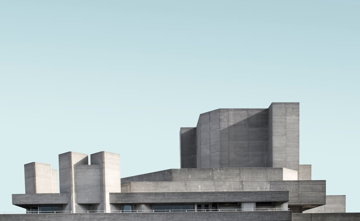
This shift is most visible in the rise of Digital Brutalism. While traditional UX design focuses on intuitive navigation, Brutalist web design often embraces raw HTML looks, stark borders, and an almost hostile disregard for conventional hierarchy. It is an intellectual flex. By making a website slightly harder to navigate, a brand signals that its audience is sophisticated enough to figure it out. It transforms the act of browsing from a passive slide into an active exploration. This is not a failure of design, but a pivot toward 'disruption experience' (DX) over 'user experience' (UX).
"The obsession with seamlessness has stripped brands of their soul. When you remove all friction, you remove all character. Ugly design is not about a lack of skill; it is about the courage to be perceived as flawed in a world of synthetic perfection."— Stefan Sagmeister, Independent Designer and Artist
Look at the global fashion landscape, and the pattern is undeniable. Balenciaga has mastered the art of the 'ugly-cool,' turning oversized, distressed sneakers and mundane DHL-inspired branding into high-status symbols. In Japan, the 'Ura-Hara' movement long ago paved the way for this, embracing a gritty, street-level chaos that rejected the polished luxury of European houses. The goal is to create a visual 'speed bump.' When a product looks intentionally wrong, it demands a justification. That justification—the story of irony, subversion, or raw honesty—is where the brand equity now lives.
But how does this actually manifest in the boardroom? As someone who has spent years navigating the tension between creative directors and growth hackers, I can tell you the debates are fierce. On one side, you have the Conversion Rate Optimization (CRO) specialists screaming that a clashing color palette will drop checkout rates by 15%. On the other, the brand strategists argue that a 'perfect' site is a forgettable site. The real-world friction isn't just in the design; it's in the internal struggle between the desire for immediate efficiency and the need for long-term cultural resonance. Practitioners are now debating 'Optimal Friction'—the exact amount of awkwardness required to be memorable without being unusable.

| Metric | The Seamless Era (2010-2020) | The Friction Era (2021-Present) |
|---|---|---|
| Primary Goal | Efficiency & Ease | Attention & Authenticity |
| Visual Language | Minimalism, Pastel, Sans-Serif | Maximalism, Neon, Brutalism |
| User Psychology | Passive Consumption | Active Engagement/Irony |
| Brand Signal | Professionalism/Reliability | Cultural Edge/Subversion |
| Success Marker | Low Bounce Rate | High Cultural Discourse |
The economic logic here is rooted in the 'Irony Economy.' For Gen Z and Alpha, who have grown up in a curated Instagram filter world, the 'ugly' is a signal of truth. A raw, unedited photo or a website that looks like it was built in 1997 feels more honest than a polished corporate campaign. According to data on consumer sentiment, there is a growing preference for 'lo-fi' aesthetics in luxury sectors, where the lack of polish is interpreted as a sign of extreme confidence (Source: Business of Fashion, 2024). If a brand is powerful enough to be ugly, it must be truly indispensable.
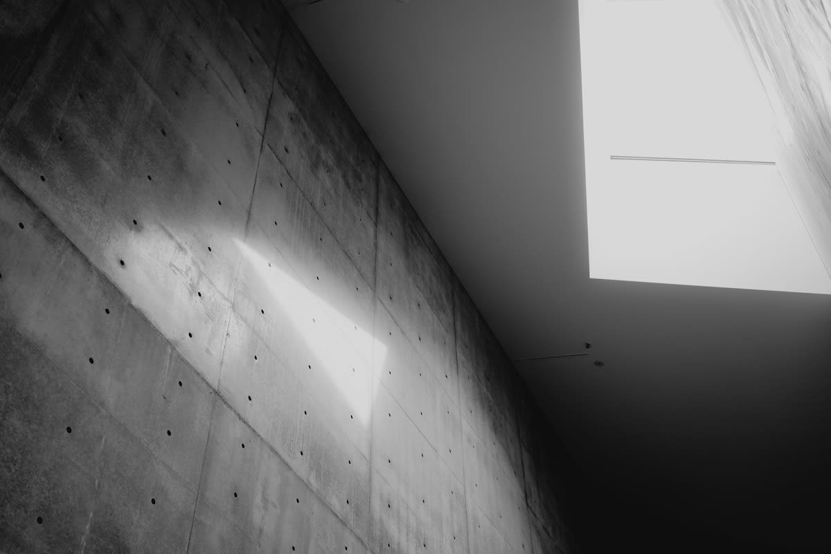
We are seeing this play out in retail spaces across Seoul, Berlin, and New York. The trend is moving away from the 'Apple Store' aesthetic—all glass and white light—toward 'Industrial Rawness.' This involves exposed HVAC pipes, unfinished concrete floors, and haphazard shelving. These spaces don't try to hide the machinery of commerce; they celebrate it. By embracing the 'ugly' bones of a building, brands create a sense of place and permanence that a sanitized, modular store simply cannot achieve.
Is this just a passing fad, a pendulum swing back from minimalism? Perhaps. But the systemic driver is the rise of synthetic media. As Generative AI makes the production of 'perfect' imagery free and instantaneous, the market value of perfection will plummet to zero. The only thing that will retain value is the 'human error'—the intentional mistake, the awkward crop, the daringly bad color choice. Friction is the new luxury because it cannot be efficiently automated.
Ultimately, the embrace of ugly design is a strategic bet on human psychology. We are wired to notice the outlier. In a sea of seamlessness, the glitch is the only thing that feels real. Brands that continue to chase the frictionless ideal risk becoming background noise. Those that dare to be a bit awkward, a bit jarring, and a lot 'uglier' are the ones who will capture the attention of a generation that is bored to death by perfection.
Fact-Check & Accuracy Note
Key claims regarding the shift toward lo-fi aesthetics and the 'Irony Economy' are based on trend analysis from WGSN (2023) and market observations from The Business of Fashion (2024). The concept of Digital Brutalism is a recognized movement within the global design community, though its direct impact on conversion rates remains a subject of ongoing debate among UX practitioners.