The hardest working font in Manhattan (2025)
Source Entity
Hacker News
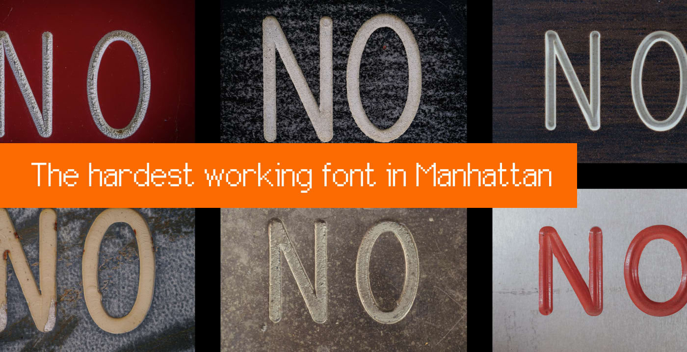
Designer Marcin Wichary explores the ubiquitous but overlooked Gorton font found throughout Manhattan. His extensive documentation highlights how this specific typeface has quietly defined New York City's visual landscape for decades.
The Silent Architect of Manhattan's Identity
In his expansive 2025 deep-dive, designer and author Marcin Wichary shifts the focus of urban typography away from the glitzy, high-profile fonts that usually dominate design discourse. While visitors often fixate on the iconic status of Helvetica or the political legacy of Gotham, Wichary directs our attention to the Gorton font. This typeface, which has quietly permeated Manhattan’s physical infrastructure, serves as the backbone of the city’s navigational and industrial signage, acting as a silent narrator of the urban experience.
The Evolution of Urban Observation
Wichary’s journey began in 2007, a period defined by the rapid democratization of high-quality digital photography and the subsequent obsession with cataloging the world’s visual aesthetic. At the time, his focus was aligned with the standard design canon—admiring the 'I <3 NYC' logo and the competitive tension between Akzidenz Grotesk and Helvetica in the subway system. However, his recent 100-mile trek across Manhattan reveals a matured perspective, one that values the 'hardest working' elements of public infrastructure over those that are merely the most famous.
Why Gorton Matters
What makes Gorton particularly fascinating is its invisibility. Despite being nearly omnipresent, it rarely receives the critical acclaim reserved for more 'designed' typefaces. Its utility-first approach reflects the industrial history of New York, where legibility and durability were paramount. By documenting this font, Wichary is not merely creating a collection of photos; he is archiving a layer of New York City’s history that is often ignored by casual observers and design tourists alike.
Historical Context and Industrial Design
The persistence of Gorton is a testament to the longevity of industrial standards. Unlike digital fonts that are swapped out with the click of a button, Gorton is physically etched, engraved, and cast into the very fabric of the city. This physical permanence means that while design trends in marketing and web media shift rapidly, the street-level typography of Manhattan remains tethered to an older, more rigid set of standards that prioritize function over aesthetic fashion.
The Broader Implications of 'Invisible' Design
This project highlights a crucial lesson for urban planners and designers: the most successful designs are often those we do not notice. When a font functions perfectly, it disappears into the environment, facilitating information transfer without drawing attention to itself. Gorton’s dominance in Manhattan serves as a case study for successful wayfinding and public communication, proving that a typeface does not need to be trendy to be essential.
Future Trends in Urban Documentation
As cities continue to modernize and digitize, the physical artifacts of old typography are at risk of being replaced by standardized, modern alternatives. Wichary’s extensive documentation—comprising thousands of photos—serves as a vital record. It suggests a growing trend in design criticism where the focus is shifting toward the 'found' beauty of functional objects, ensuring that even if these signs are eventually replaced, their legacy is preserved in the digital archive.