"Cleaner, Modern": Instagram Changes Its Wordmark Logo After A Decade
Source Entity
NDTV News Search Records Found 1000
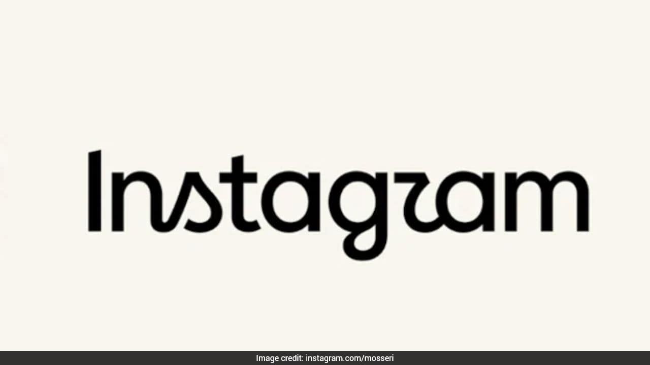
Instagram has officially updated its wordmark for the first time in a decade, moving to a modern design. While head of Instagram Adam Mosseri claims it offers a cleaner look, the change has sparked mixed reactions regarding its legibility.
A Decade of Design: Instagram's Wordmark Evolution
For the first time in ten years, Instagram has officially retired its long-standing cursive wordmark in favor of a new, updated design. This change represents a significant shift for the platform, which has relied on its recognizable, flowing script logo to anchor its visual identity since its early days. The company, through head of Instagram Adam Mosseri, has framed this transition as a necessary evolution to ensure the brand remains "sharper and more modern" in an increasingly competitive social media landscape.
The Rationale Behind the Refresh
According to official statements, the decision to pivot away from the decade-old typeface was driven by a desire for simplicity and a nod to the platform's "craft." Mosseri, in his announcements across both Instagram and his personal Threads account, emphasized that the previous logo had become dated. By seeking a "cleaner" aesthetic, the company aims to align its text-based branding with the minimalist design language currently favored by many major tech conglomerates.
Public Perception and Design Criticism
Despite the corporate messaging, the reception to the new wordmark has been sharply divided. Critics have pointed out that the hybrid "half-cursive, half-print" style of the new font has created unexpected legibility issues. Some users have jokingly suggested that the new lettering is difficult to decipher, with some even claiming it appears to spell "Instagzam." This highlights a common tension in modern branding: the struggle to balance a desire for contemporary minimalism with the functional need for instant brand recognition.
The Broader Context of Tech Branding
In the fast-paced "fruit fly life cycle" of the tech industry, a ten-year lifespan for a logo is remarkably long. While some observers have praised the font choice as a fresh update, others have used the opportunity to critique the platform's broader trajectory. The change has become a lightning rod for those who feel the platform has moved away from its roots, with some critics labeling the change as an example of "corporate slop" that masks deeper frustrations regarding algorithmic changes and data-driven user experiences.
Implications for Future Trends
This rebrand serves as a case study in the risks associated with altering iconic visual assets. Instagram's willingness to crowdsource reactions on Threads demonstrates a new, more transparent approach to corporate decision-making, even when the feedback is overwhelmingly skeptical. As companies continue to iterate on their identities, the balance between "modernizing" and "alienating" existing user bases will remain a critical challenge. Whether this new wordmark eventually settles into the cultural consciousness or remains a point of contention, it underscores the intense scrutiny that accompanies even the smallest aesthetic shifts in global digital products.
Verification Required?