This is Instagram’s new logo
Source Entity
Jess Weatherbed
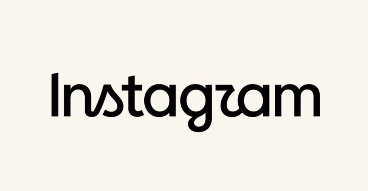
Instagram has updated its iconic wordmark after a decade, shifting to a redrawn script typeface intended to modernize the brand. The change has sparked significant debate, with critics questioning its legibility and aesthetic direction.
The Evolution of Instagram’s Visual Identity
After a decade of consistency, Instagram has officially unveiled a refreshed wordmark, marking a significant departure from the recognizable cursive typeface that has defined the brand since its early days. Head of Instagram, Adam Mosseri, introduced the change by describing the new look as "cleaner and more modern," emphasizing that the update seeks to honor the platform's history while reflecting a commitment to simplicity and craft. This transition represents the first major overhaul of the top-app wordmark in ten years.
Design Controversies and Legibility
Despite the company's intention to modernize, the reception has been polarized. Critics have pointed to the new letterforms, which blend cursive and print styles, as being less legible than the previous iteration. Some users have humorously suggested that the new design is difficult to read, with remarks claiming it looks more like "Instagzam" than "Instagram." This tension highlights the difficulty of updating a legacy brand identity that has become deeply embedded in the cultural lexicon.
Corporate Messaging vs. Public Perception
Adam Mosseri’s proactive approach to the announcement—sharing the news on his Threads account to solicit "hot takes"—suggests an awareness that visual rebrands often invite public scrutiny. While the company frames the update as a strategic refresh, external commentators have characterized the move as "corporate platitudes." This reflects a broader trend in tech, where companies attempt to project an image of evolution while facing pushback from a user base that often prioritizes familiarity over aesthetic modernization.
The Role of Design in the Tech Lifecycle
In the fast-paced world of digital platforms, a ten-year lifespan for a logo is considered quite long. The decision to update the wordmark is part of a larger trend of "frenzied tech rebirths," where platforms seek to re-establish their relevance through visual cues. However, this update has also served as a lightning rod for broader criticisms of Instagram, with some observers using the design change as a springboard to discuss the platform's relationship with algorithmic content and data practices.
Future Implications for Brand Consistency
Ultimately, the success of this new wordmark will depend on how quickly it becomes normalized in the user experience. While the immediate reaction focuses on the perceived "slop" or illegibility of the new script, historical precedent suggests that users often adapt to these changes once they are integrated into daily usage. Moving forward, Instagram will need to balance its desire for a "modern" aesthetic with the functional necessity of maintaining a brand that is instantly recognizable to billions of global users.
Multiple Citing Sources