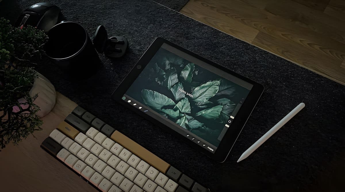
The Philosophy of Quiet Design
The modern user is exhausted. When we flood a screen with flashing banners, auto-playing videos, and neon gradients, we aren't just providing information; we are triggering a fight-or-flight response in a brain already strained by a thousand notifications. Quiet design isn't about minimalism for the sake of fashion. It is a functional response to cognitive overload. By reducing the sensory noise, we allow the actual message to breathe, transforming the user experience from a battle for attention into a moment of clarity. Why do we continue to design for the most distracted version of our users instead of the most focused one?
The Core Thesis
Low-stimulus design is not the absence of stimulation, but the intentional curation of it. The goal is to lower the barrier to entry for the brain, making the consumption of information an act of ease rather than an act of endurance.
This approach draws from global traditions of restraint. Consider the Japanese concept of Ma, the pure space between objects, which suggests that the void is just as important as the form. Or look at the Scandinavian approach to functionalism, where utility dictates the aesthetic. In a globalized digital economy, these principles are no longer niche; they are essential. When a user in Seoul, Nairobi, or Berlin opens your app, they aren't looking for more noise. They are looking for a sanctuary where they can complete a task without feeling a spike in cortisol.
Prerequisites: What You Will Need
Before you begin stripping away elements, you need a framework. You cannot design for low stimulus if you are still measuring success by 'time spent on page' or 'click-through rates' driven by urgency. You need a mindset shift: move from capturing attention to preserving it.
- A sensory audit tool: A method to categorize every element of your content as 'essential' or 'distractive'.
- An accessible, muted color palette: Avoid pure blacks (#000000) and pure whites (#FFFFFF) to reduce eye strain.
- WCAG 2.1 Guidelines: Ensure that 'quiet' doesn't mean 'invisible' by maintaining proper contrast ratios.
- A restrictive typography set: Limit yourself to two complementary typefaces maximum.
- User empathy maps: Specifically focusing on users with ADHD, autism, or general burnout.
Once these tools are in place, the process becomes a series of subtractions. Most designers are taught to add features to solve problems. The Master Practitioner knows that the most elegant solution is often the one that removes the friction entirely.
The Step-by-Step Implementation
- Conduct a Sensory Audit: List every visual, auditory, and haptic trigger in your current content. Identify 'high-frequency' elements like pop-ups, auto-plays, and high-contrast flashing colors. Mark these for immediate removal or transformation.
- Establish a Low-Contrast Foundation: Replace stark contrasts with softened tones. Instead of black text on white, use a deep charcoal on a soft cream or light grey. This reduces the 'vibration' effect on the screen, which is a primary trigger for sensory overwhelm.
- Implement Strategic Negative Space: Increase the margins and line-height beyond standard defaults. Give every paragraph and image a 'buffer zone' of at least 20% more space than you think it needs. This signals to the brain that the information is manageable.
- Curate Typography for Cognitive Ease: Choose sans-serif fonts with open apertures and generous x-heights. Avoid overly stylized scripts or condensed fonts that force the eye to work harder to decode the letters.
- Simplify Interaction Patterns: Remove non-essential micro-animations. If a button bounces or a menu slides in with a jarring speed, it adds to the cognitive load. Use slow, linear transitions that feel organic rather than mechanical.
- Validate via Stress-Testing: View your content in a high-distraction environment. If the core message is still clear and calming amidst external noise, you have achieved the Quiet Aesthetic.
The execution of these steps requires a ruthless commitment to the user's mental state. For instance, when refining the color palette, don't just pick 'pastel'. Pick colors that evoke stability. Sage greens, slate blues, and warm sands are globally recognized as calming. Avoid the 'corporate blue' or 'urgent red' that trigger subconscious associations with alerts or professional stress.
"The most sophisticated design is not when there is nothing left to add, but when there is nothing left to take away without losing the essence of the message."— Industry Design Standard
Typography is where many low-stimulus attempts fail. A font that is too light becomes a struggle to read; a font that is too heavy feels like it's shouting. The sweet spot lies in medium weights with ample tracking. By increasing the space between letters slightly, you prevent the 'crowding' effect that can trigger anxiety in neurodivergent users.
| Element | High-Stimulus Approach | Low-Stimulus Approach |
|---|---|---|
| Color Palette | High saturation, pure contrast | Muted tones, soft contrast |
| Layout | Dense, multi-column, cluttered | Single-column, generous whitespace |
| Motion | Fast, unexpected, frequent | Slow, predictable, purposeful |
| Typography | Varied weights, bold headlines | Consistent weights, clear hierarchy |
| Notifications | Intrusive, immediate, loud | Passive, batched, subtle |
Beyond the visual, consider the temporal dimension of your content. How fast is the user expected to move? High-stimulus design creates a sense of artificial urgency through countdown timers and 'limited time' banners. Low-stimulus design removes the clock. It allows the user to set their own pace, which fundamentally changes the emotional relationship between the human and the interface.
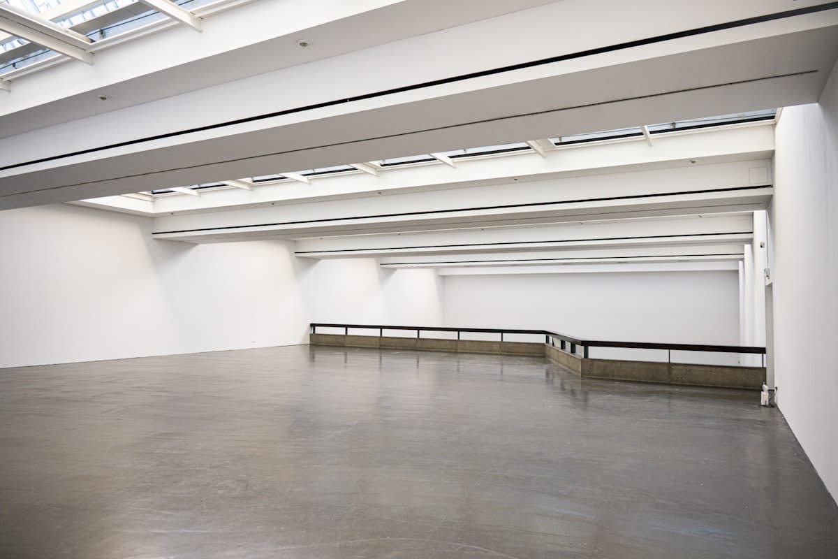
This transition from 'urgency' to 'agency' is the hallmark of a master practitioner. When you give the user control over their sensory intake, you build a deeper level of trust. This trust translates into higher long-term retention. While high-stimulus content might win the first three seconds of attention, low-stimulus content wins the next thirty minutes of engagement.
Common Pitfalls
The most frequent mistake is confusing 'low-stimulus' with 'boring' or 'empty'. A void is not a design; it is a lack of design. If you remove all the guidance and cues from your interface, you aren't reducing stimulus—you are increasing cognitive load because the user now has to guess how to navigate. This is the 'Empty Trap'. Your content must still be intuitive; it just shouldn't be loud.
Another critical error is neglecting accessibility. In the pursuit of a muted aesthetic, designers often drop the contrast too low, making the content unreadable for those with visual impairments. Remember: quietness is for the nervous system, not for the eyes. Always run your muted palette through a contrast checker to ensure you are meeting AA or AAA standards.
Finally, avoid the 'One-Size-Fits-All' fallacy. Not every piece of content should be low-stimulus. An emergency alert needs to be high-stimulus. A luxury meditation app should be low-stimulus. The skill lies in knowing when to whisper and when to speak clearly. If everything is quiet, nothing is prioritized.